
Designing the foundations of dashboard builder for HR experts - MVP
HR experts relied on Customer success teams to create dashboards and reports for them. We launched a Minimum Viable Product version of Stories, allowing customers to create their own stories, themselves.
B2B
〰️
Analytics
〰️
HR technology
〰️
Dashboard creation
〰️
B2B 〰️ Analytics 〰️ HR technology 〰️ Dashboard creation 〰️
Overview
Duration
1 year
My Role
UX Research
Product Design
UI Design
Deliverables
Research insights
User flows
Information architecture
Hi-fidelity designs
Component library
Team
Product Manager
4 Front end developers
1 Backend developer
Technical lead
Product Designer (Myself)
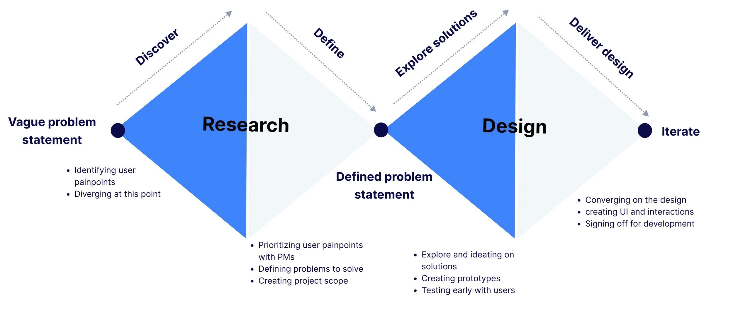
For about 12 months, I led the end-to-end design process working intensively with with engineers, PMs and business stakeholders to bring the story creation experience to life.
It included identifying user painpoints, leading design strategy, user research, defining the user flows and creating visuals for iteratively designed features.
The before..
And the after..
The business problem…
Non-scalable, inefficient & manual data report creation process
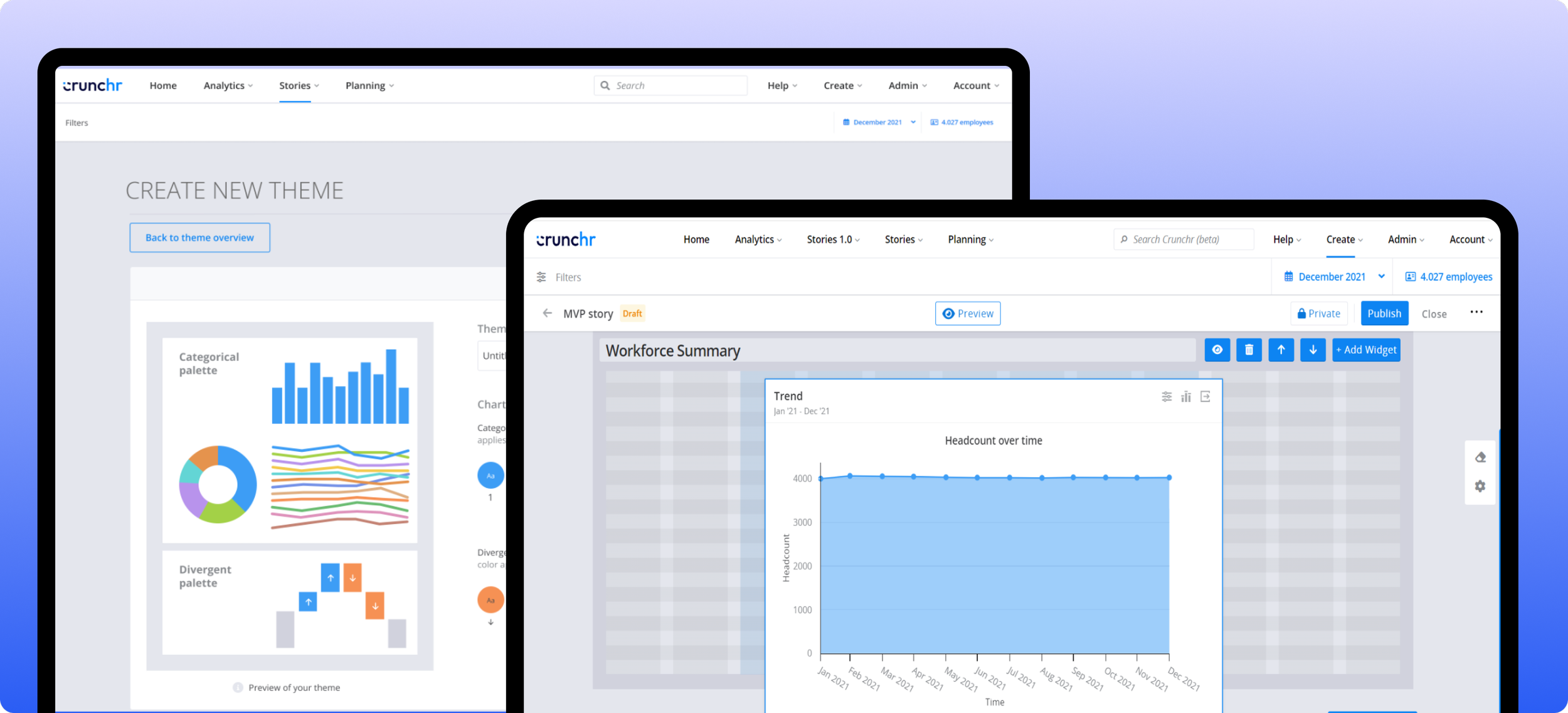
Crunchr had a custom reporting feature (Stories v1) that was not scalable
The feature wasn’t self service, meaning customers could not build it themselves, Customer success teams built it for them
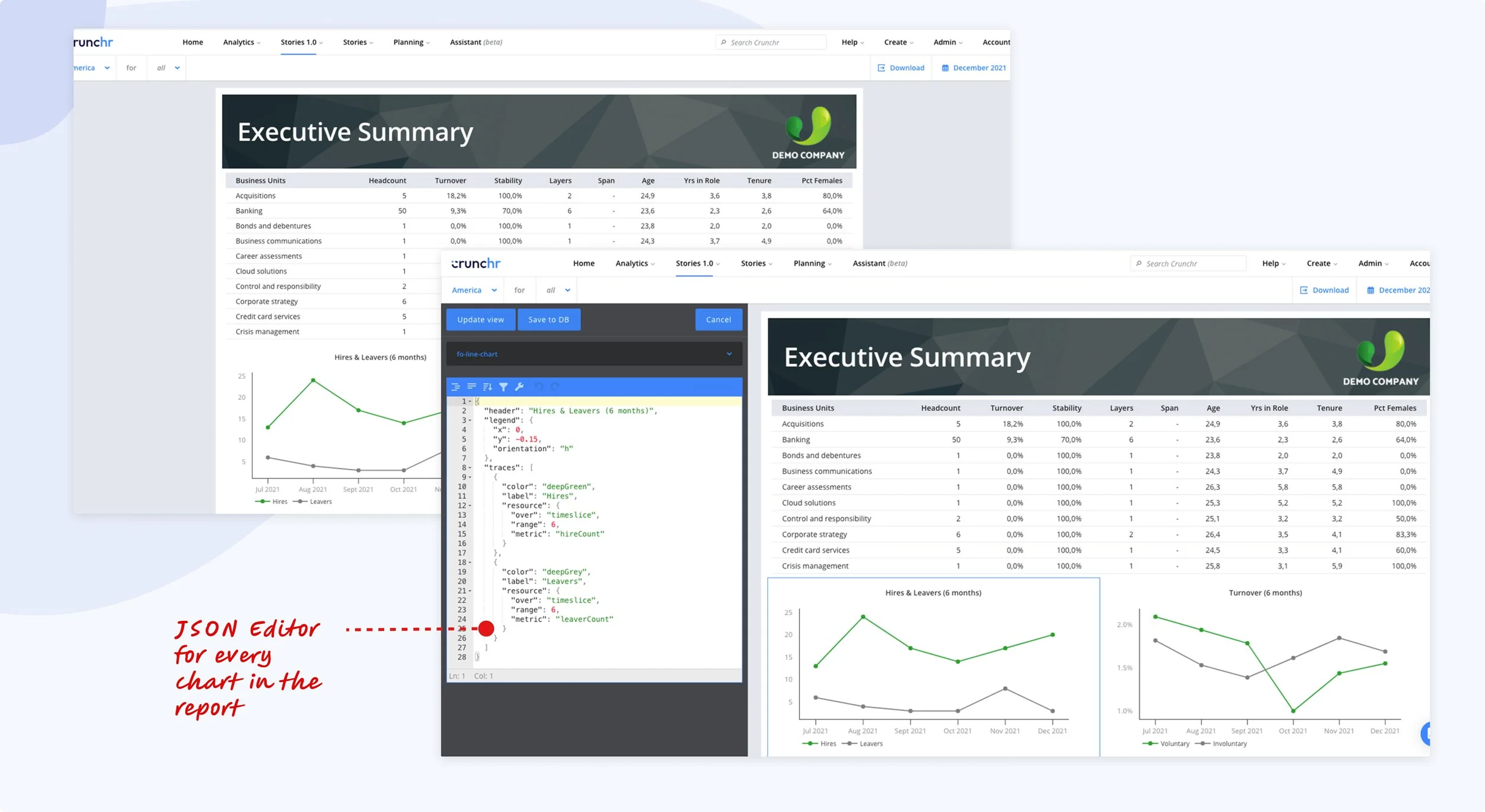
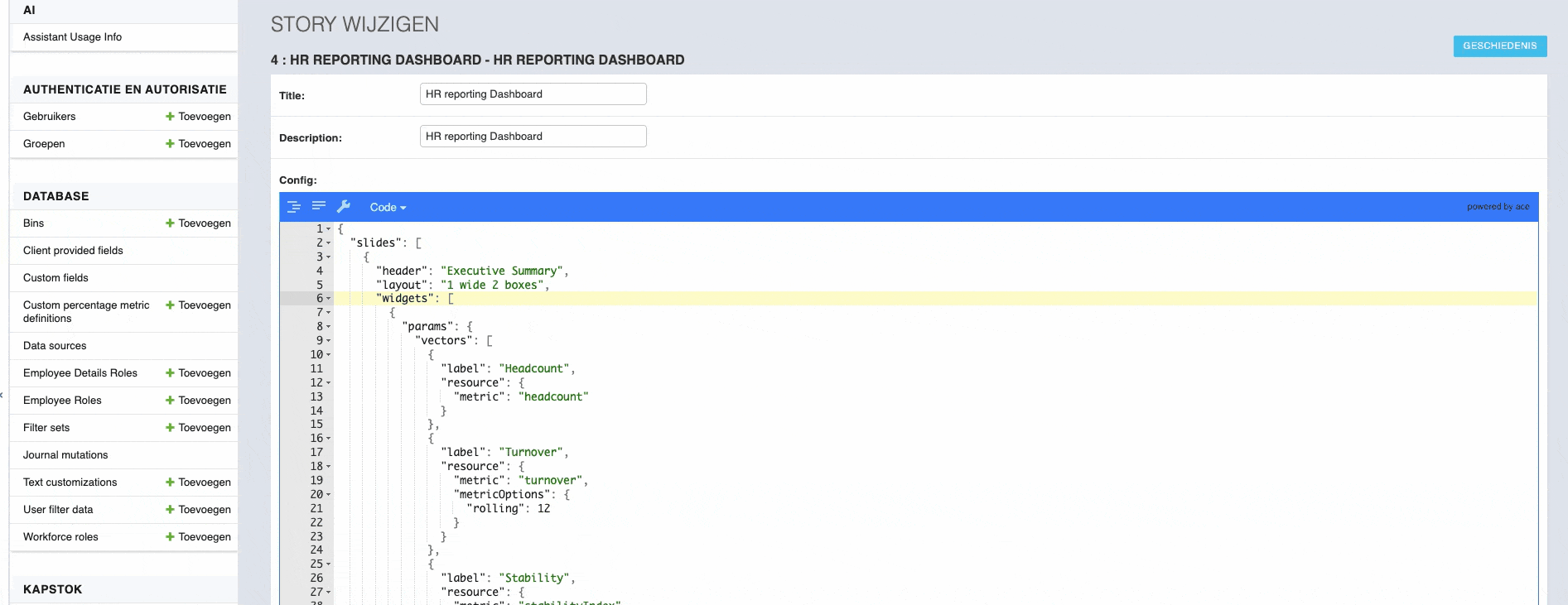
It had technical limitations with a separate widget system and code editor using JSON
How did I go about this problem?
During research, I found there was lot of back and forth between Customer success and customers
On some research, there usually was a ton of back and forth between CS and customers to get the right report and story on Crunchr. CS would spend days/ months trying to understand customers’ requirements, creating a story, sharing it with the customers, and then getting feedback on the tiniest of the details. This was time-consuming and inefficient both to CS and customers as it would take a lot of time to have a single report up and running.
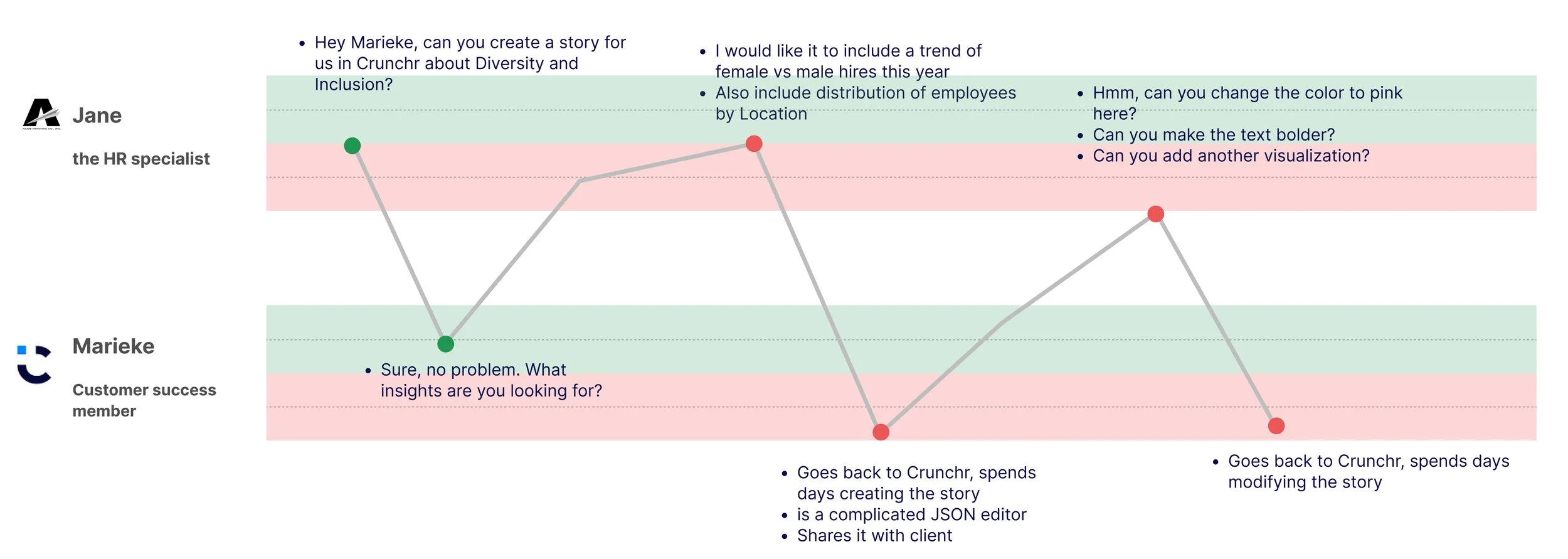
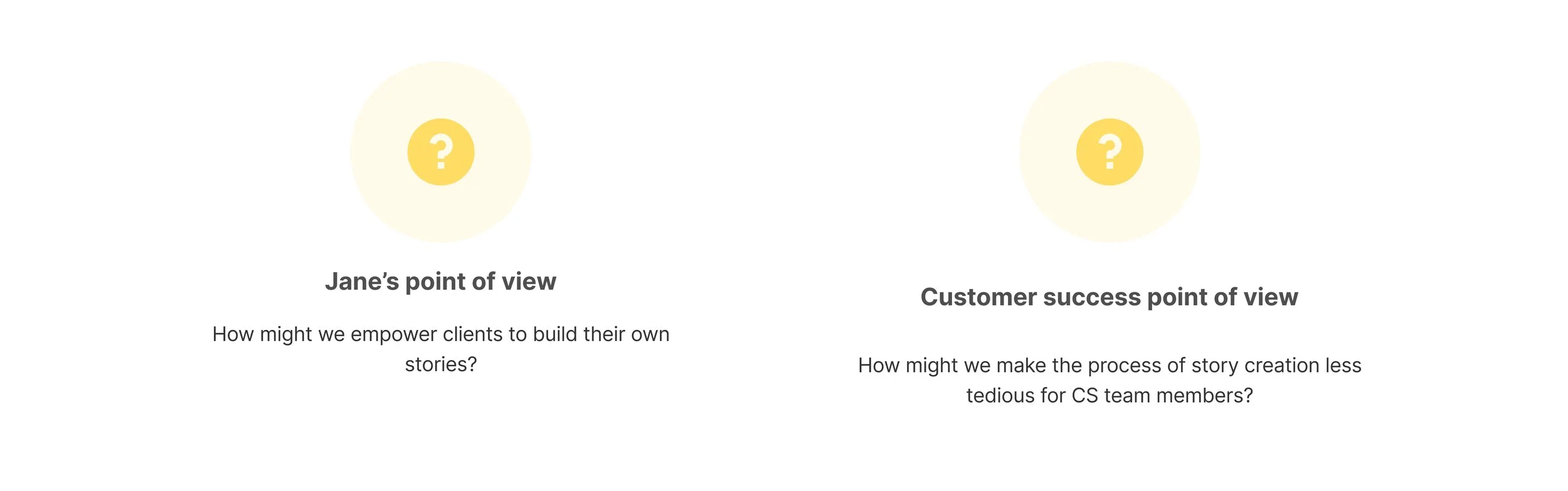
Jane’s POV - Delayed cumbersome reporting
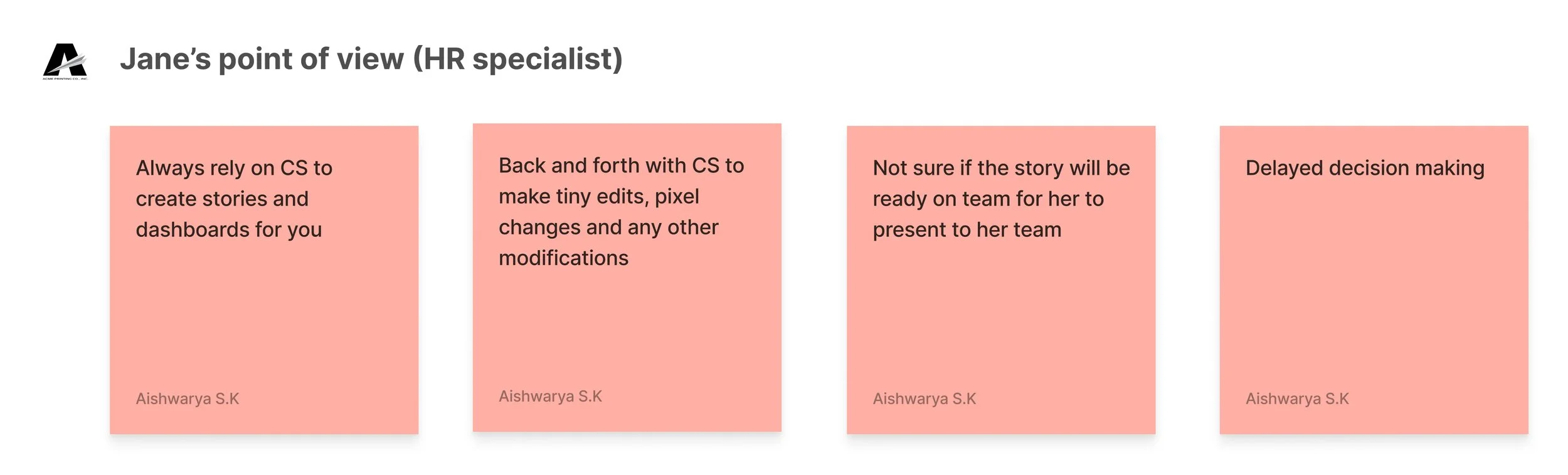
Jane’s motivation as a HR specialist of her org, was to tell the right story, deliver reports as quickly as possible to her business stakeholders, but was unable to do so as she heavily relied on CS to build reports for her
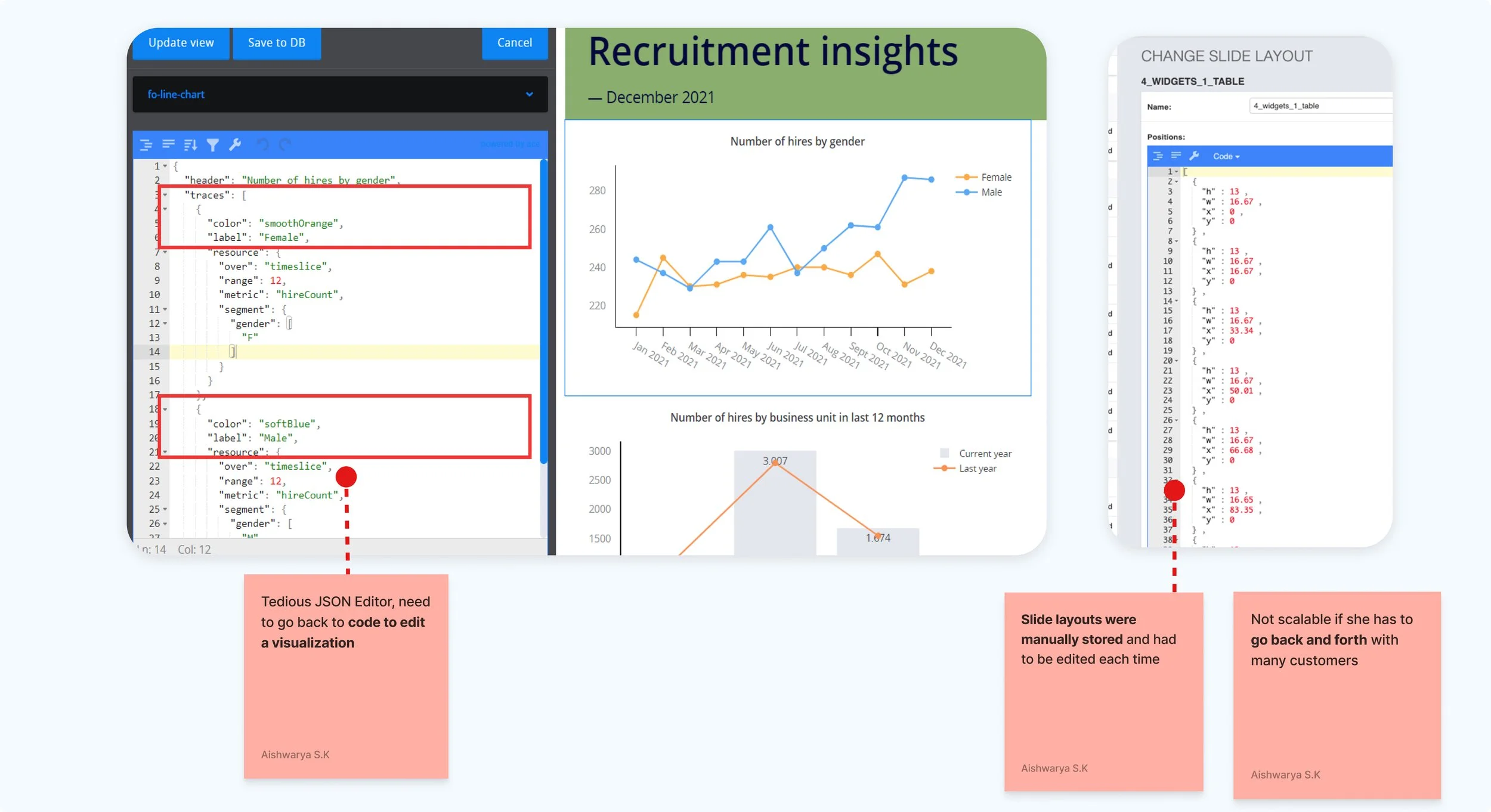
Customer success’s POV - Lots of manual labor to create a report
For CS on the other hand, making any edits to a chart required manual labor of going through the JSON editor to change the color, position, data series etc of the chart. The height, width, x position, y position of a chart were all stored in a page configuration as manual entries.
How might we?
After getting an understanding of the painpoints, we (myself, Product Manager, Business stakeholders) started asking ourselves, how might we solve for them?
An opportunity for the business.. Moving from service to self-service model
Although the problem was for Jane, the HR specialist and Customer success teams, this was ultimately hurting the business as it was following a service offering model. After some brainstorming, business wanted to take the direction of a self serve dashboarding tool as that would extend the product offering and could generate revenue with product upsells.
The scope
Along with PM and EM, we decided to break the project into 2 phases.
In phase 1, we would launch the MVP of the story creation experience, but keep it internal facing (i.e CS would be able to use it) & in phase 2, we would incorporate feedback from CS and early customers, then roll it out for all customers.
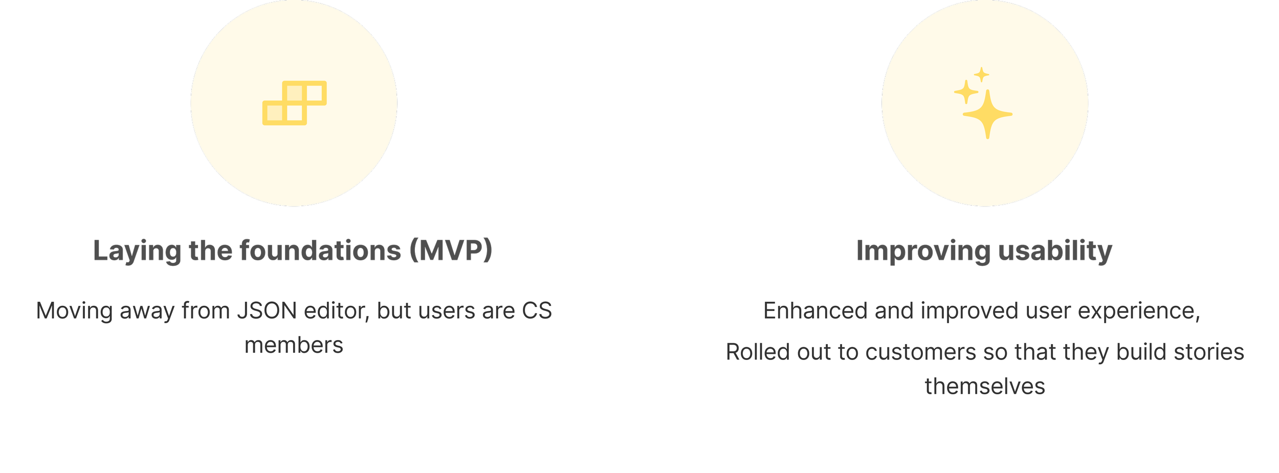
Scope for the MVP
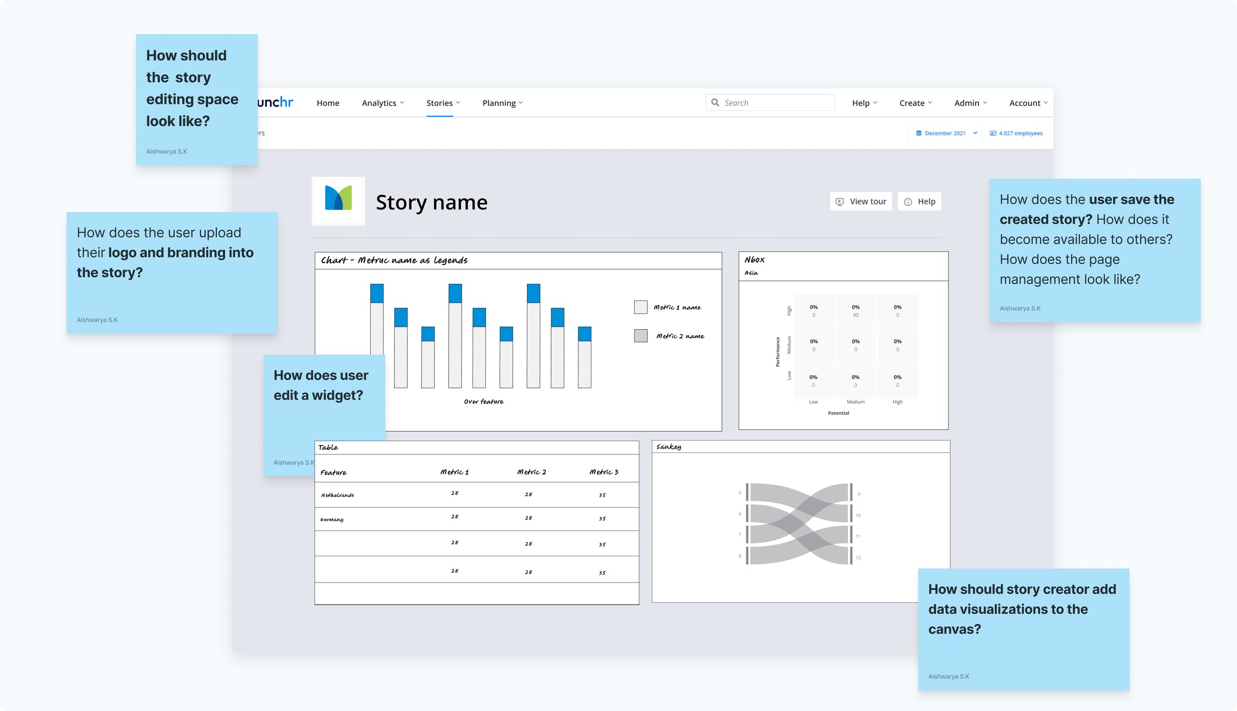
As this was a massive project, there were a lot of sub components to work on:
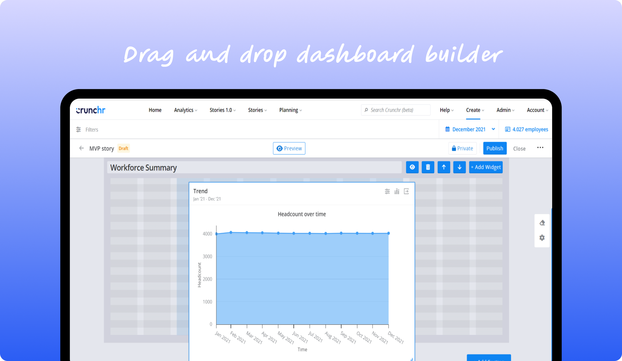
A grid canvas that would allow dropping & resizing widgets into the canvas
A widget configuration space to configure widgets (with various options for widget configuration)
Being able to apply theming and colors to a story
Design strategy
The goal of this MVP was not to focus too much on crafting the perfect UX rather chose to have all the functionalities in place
Functionality focused
It was important to look at dashboarding experience of other tools to match the mental model of story creators
Familiarity
Make it feel light and easy to use. Increase the productivity of CS team members
Simple to use
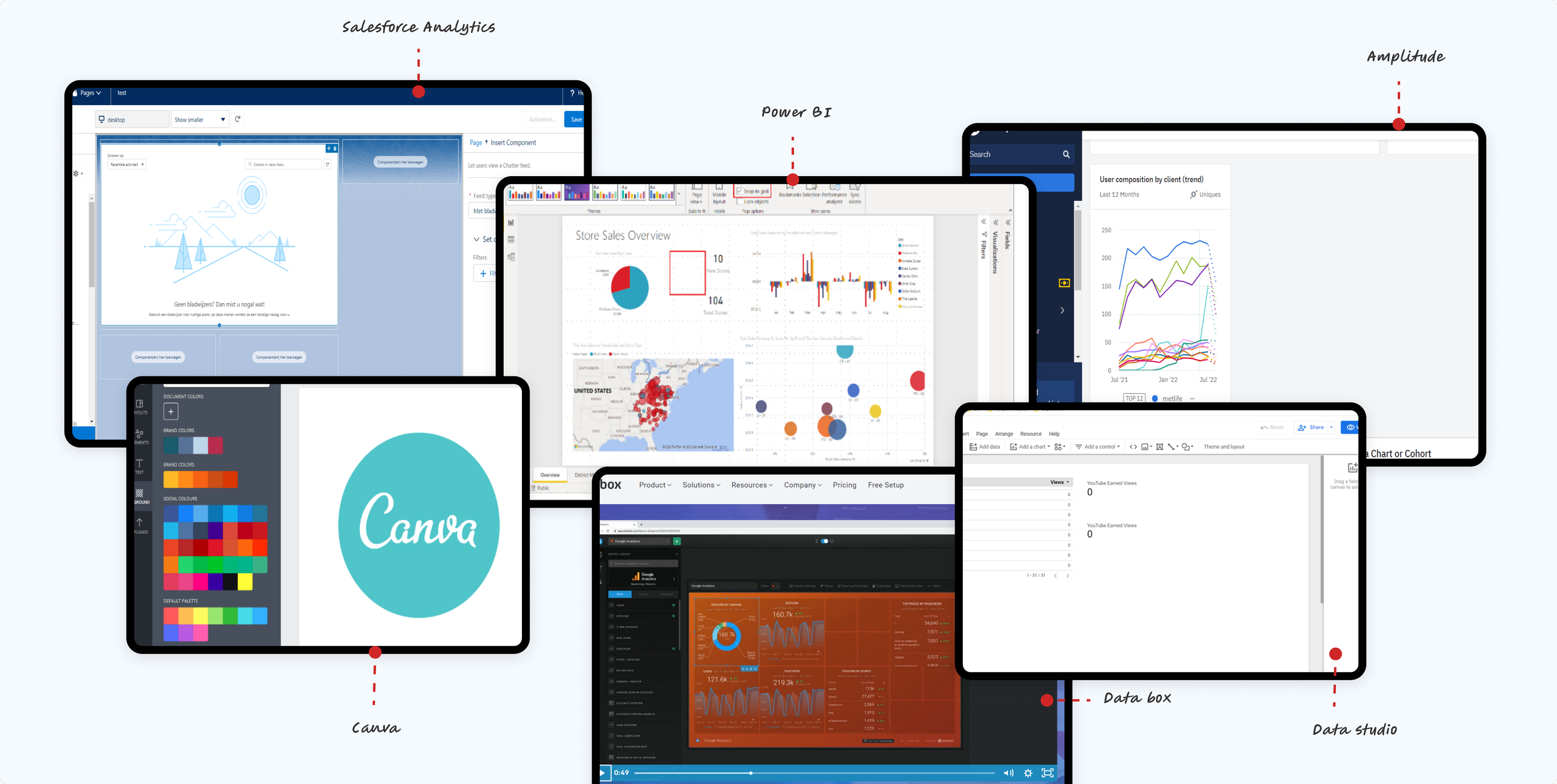
Getting some inspo..
I explored various dashboarding tools to analyze their methods for adding widgets to a canvas. Each tool presents its own unique configuration space, offering distinct features and customization options.
Generally, the process of adding a widget begins with either with selecting it from a library or creating it on the spot. This is typically followed by dragging the widget onto the canvas, where users can position it as needed.
Many tools provided a snap-to-grid feature, aiding in evenly spacing and aligning the widgets.
Overall, the usability and flexibility of these dashboarding tools varied significantly, making it essential to consider the specific needs of the current project
Adding the grid layout for dashboard canvas
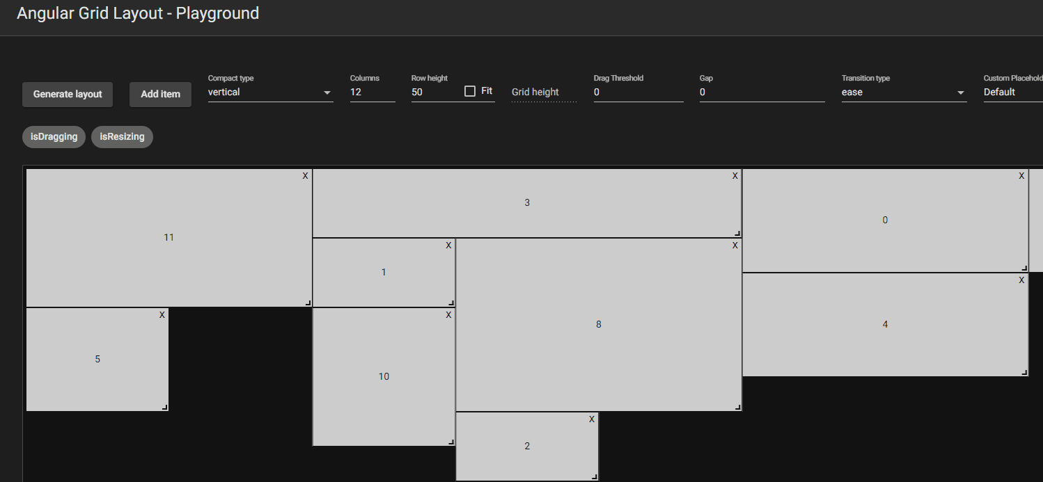
Together with developers I looked at possible grid systems that would form the base canvas for the dashboard.
Katoid grid allowed for automatic shifting of widgets during resize or movement of 1 widget, whereas with Angular grid, you can see that each widget’s position is absolute and does not realign when moving another widget. After collaborating with developers a Katoid grid was chosen to also be technically feasible.
Katoid grid
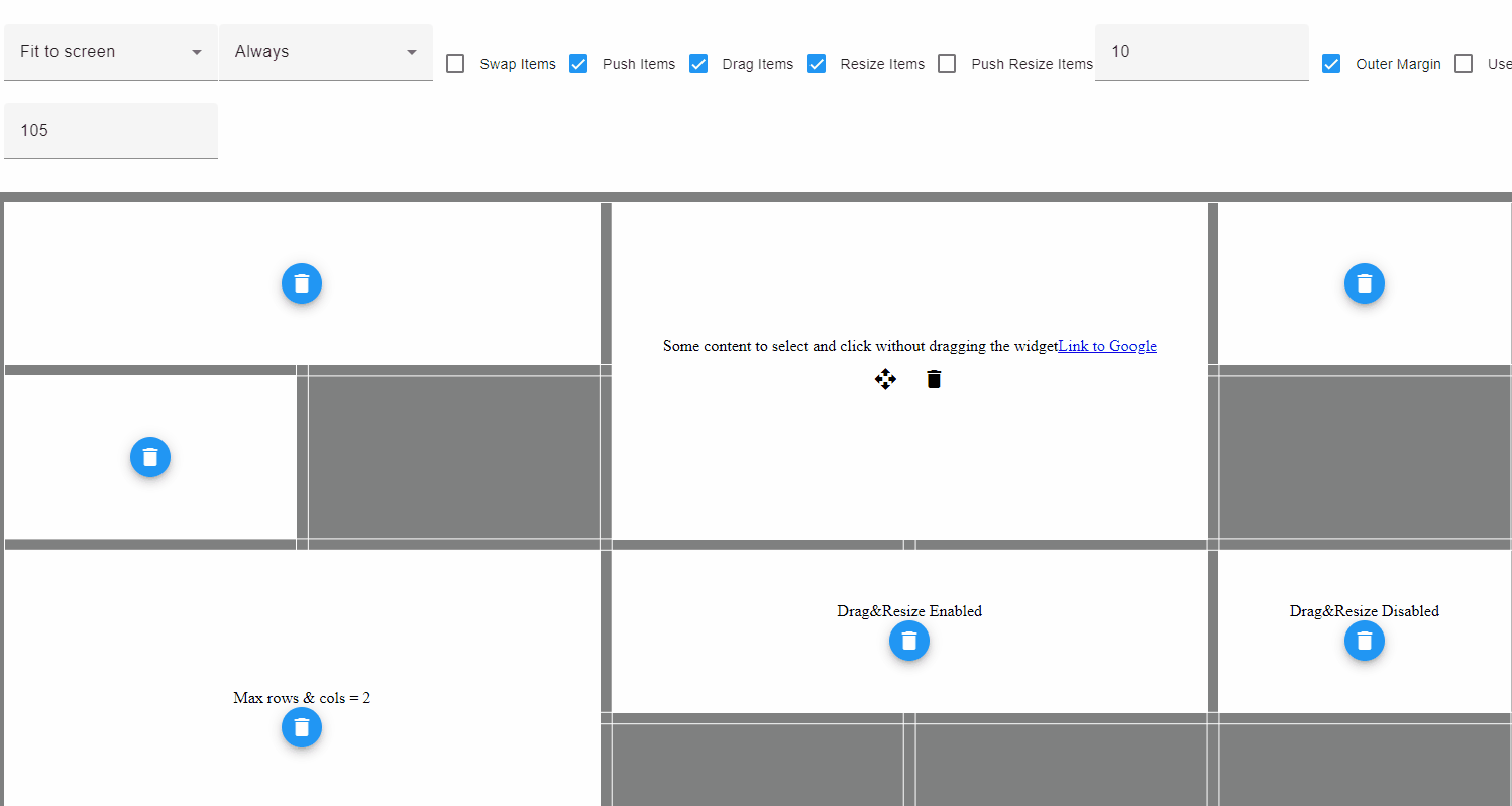
Angular grid
I iterated on the design multiple times.
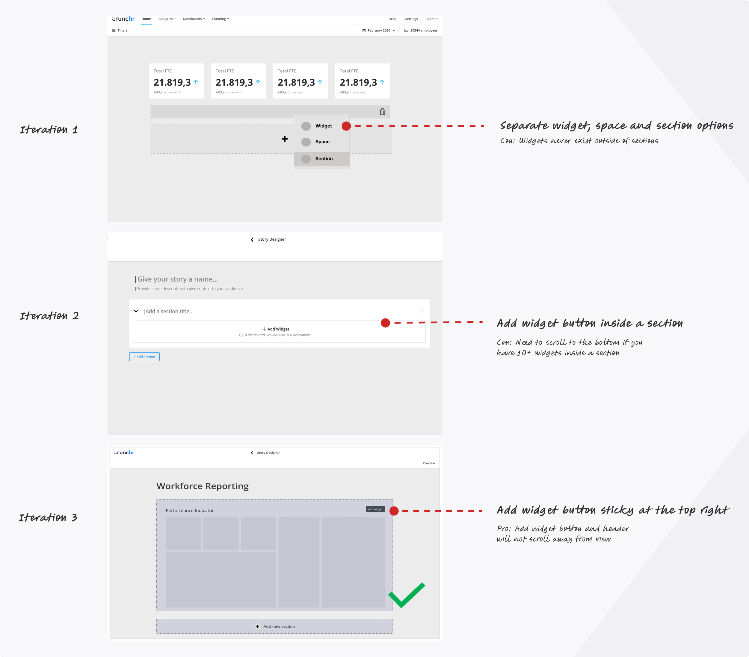
Initially, I defined three options: Widget, Space, and Section, triggered by a + CTA. However, we realized that widgets must exist within a section, making separate options unworkable. I simplified the design by displaying an ‘“Add widget” button within a section. This caused UX issues when users added 10+ widgets, requiring excessive scrolling. To enhance usability, I moved the "Add Widget" button to the top right of the section and made the header sticky, ensuring it remains visible even with many widgets.
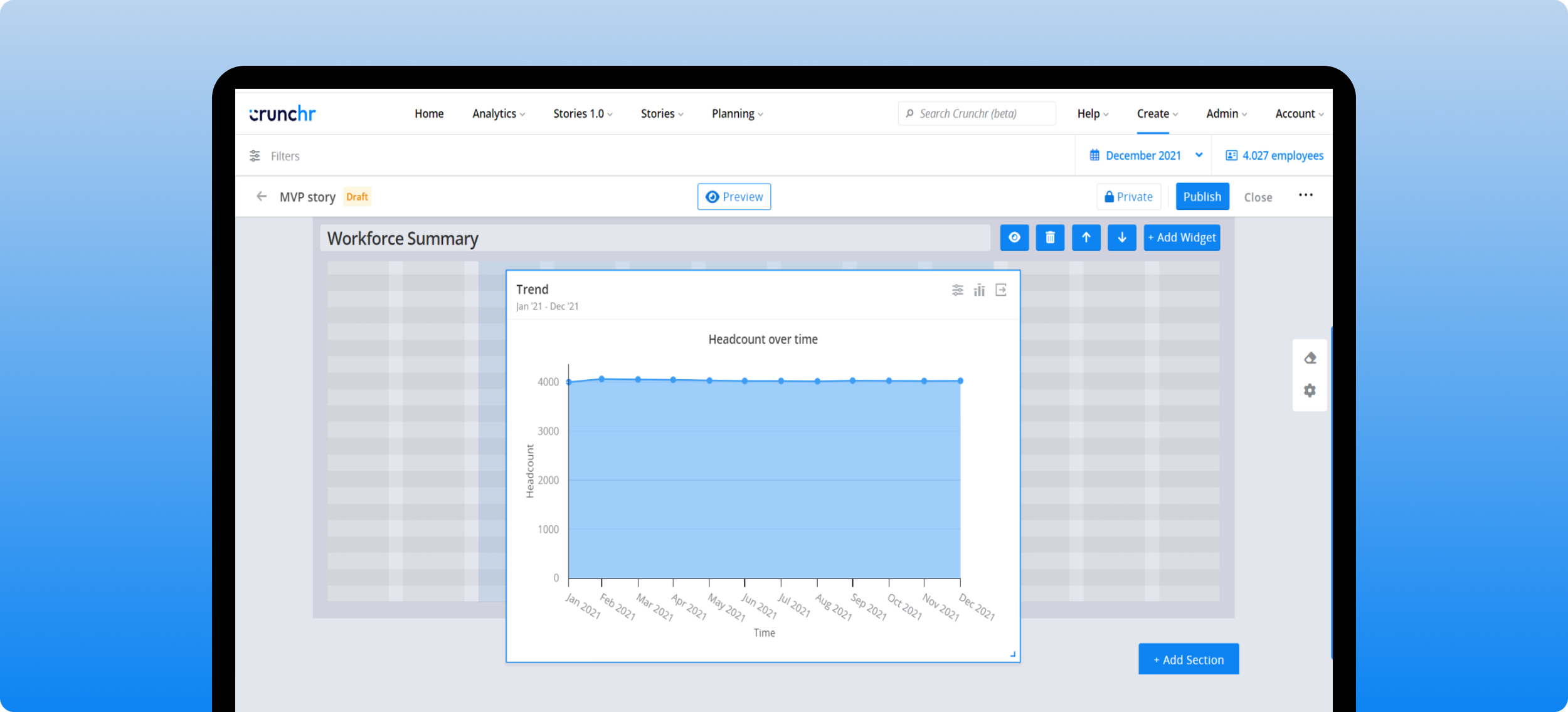
Adding widgets to the canvas
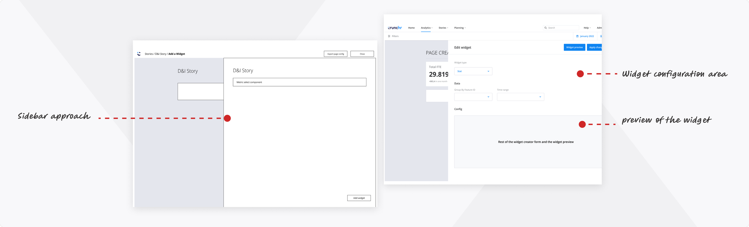
Widget configuration space:
Since the product already utilized sidebars, I decided to adopt the same approach for editing widget configuration options.
This version prioritized implementing functionality above refining the user experience. By maintaining consistency with the existing layout, the aim was to match model of the users. We decided to address enhancements in usability to create a more intuitive interface in phase 2.
Color themes for the visualizations
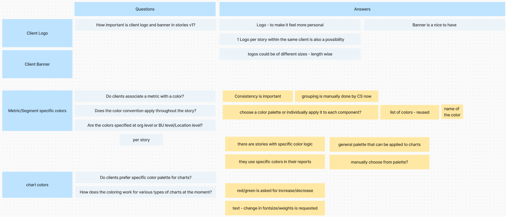
For theming, the need was to be able to apply the customers’ brand colors to make the story feel personalised. I first looked at theming experiences of other tools while also interviewing business stakeholders to identify requirements. There were questions I had in mind:
Do they store a theme centrally and apply it to each story or is the theme created on the go locally?
Does a company only have 1 theme? Why would they need multiple themes?
What is a theme? Is it a set of colors as in color palettes or does it also include typography, logo, spacing etc?
How should colors be defined and applied to the widgets? Do we need separate color system for categorical, divergent and sequential data?
I noticed many tools only let you add colors to a palette and show them as swatches. However, I wanted to do something more. I imagined a live preview of a sample story that updates as you change colors, so you can see how the colors would look in the story.
Ideas
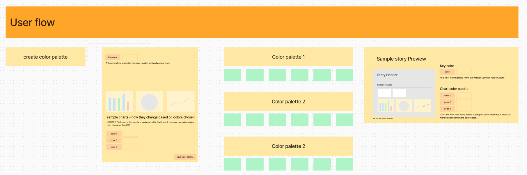
I then started iterating on the designs for how the theme overview page would look like, how the theme detail page would look like and also how would you then apply the theme to any story.
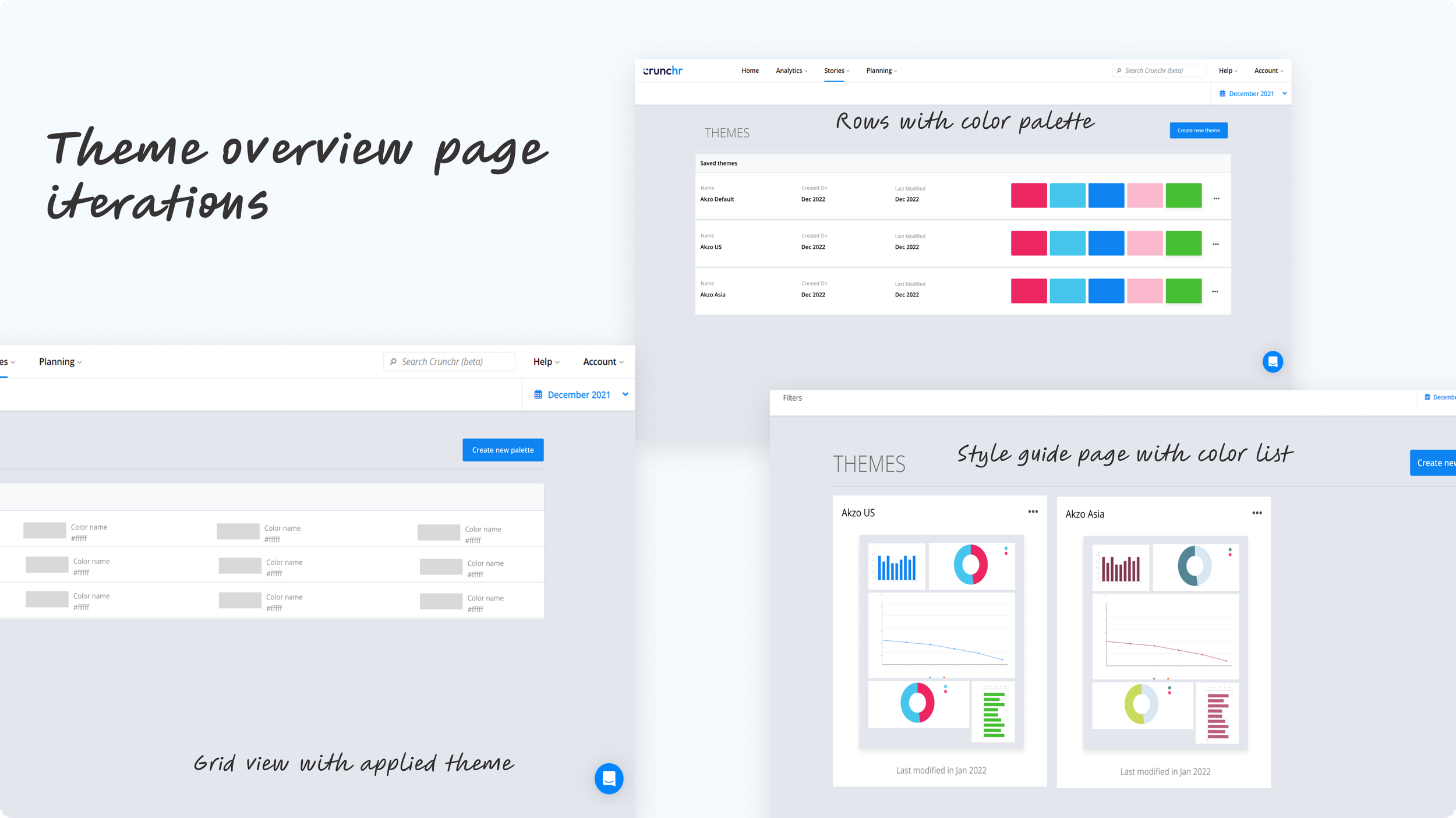
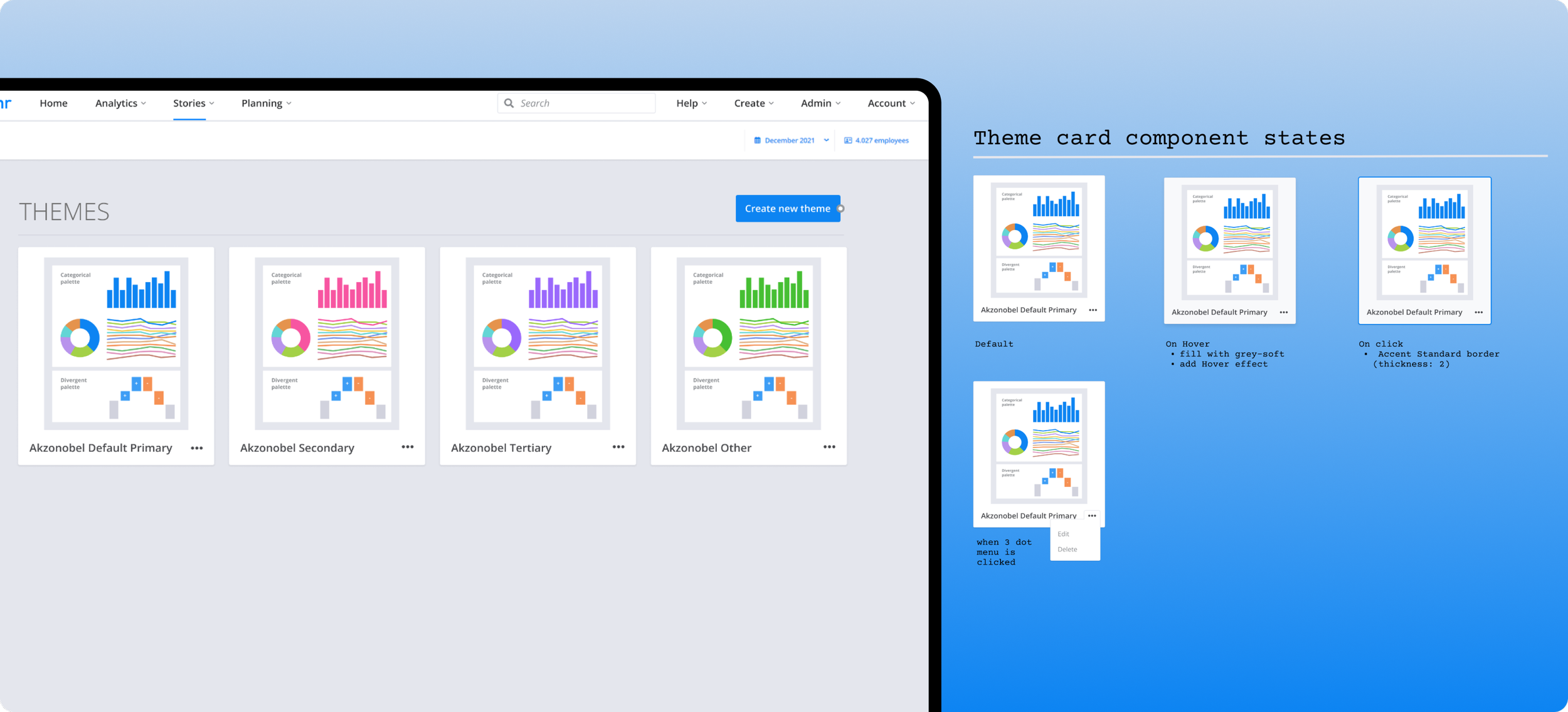
Theme overview: I decided to show a grid view of themes that shows color previews.
This enhancement makes it significantly easier for users to quickly see, recognize, and clearly identify the various themes present within the interface, alongside their corresponding main colors, which ultimately allows for a more efficient, organized, and visually engaging experience overall.
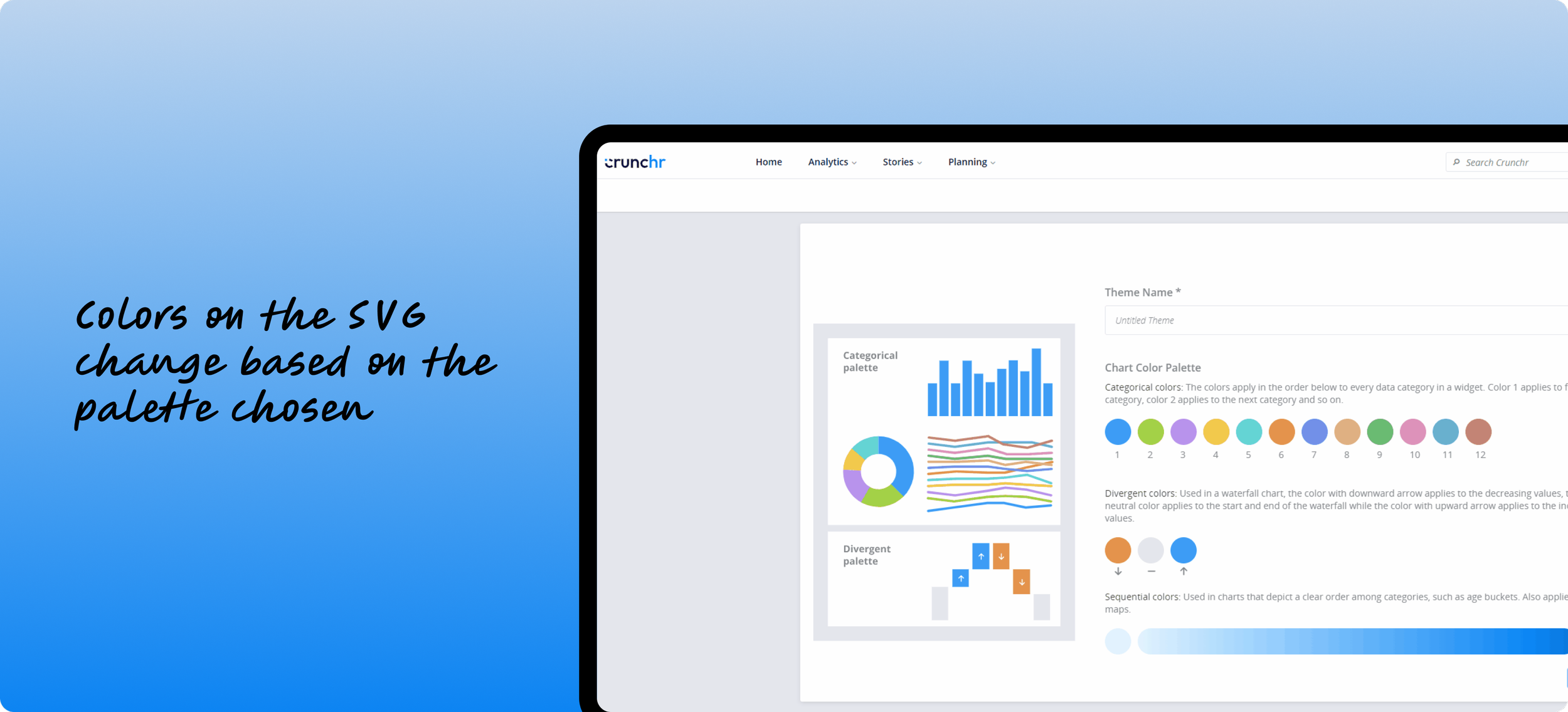
Creating the palette: Any color changes showed up in the preview SVG on the left side of the page.
On the theme detail page, I included two distinct color palettes to cater for different visualizations: one specifically designed for categorical charts and another tailored for divergent charts. This differentiation allows for a more effective and visually accurate consumption and representation of data across various chart types, ensuring that users can easily interpret the information presented.
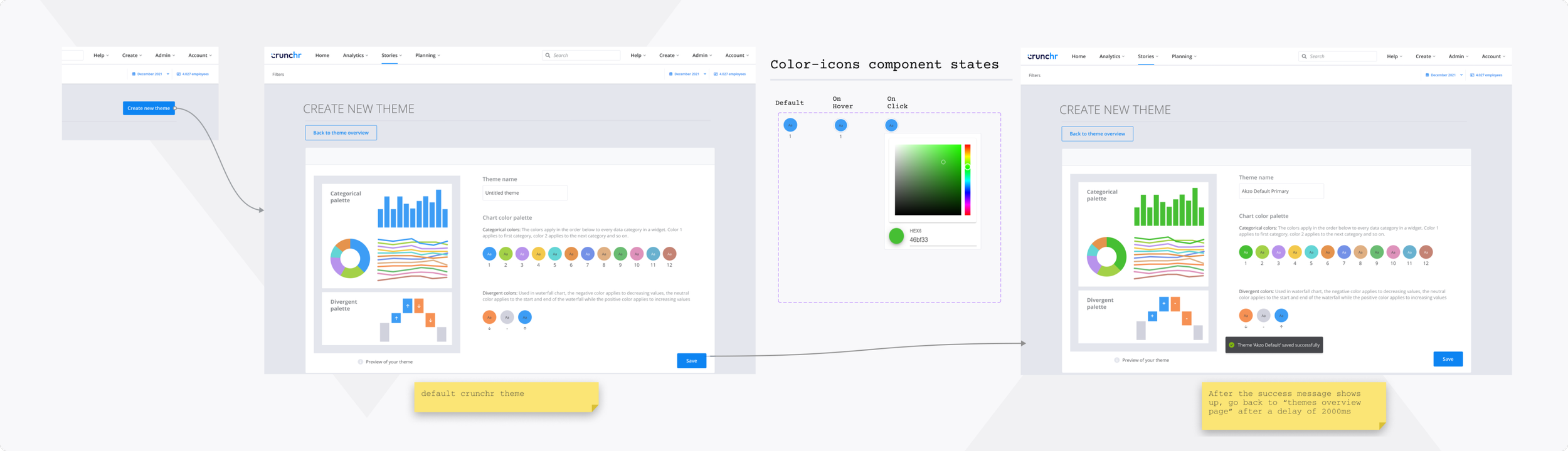
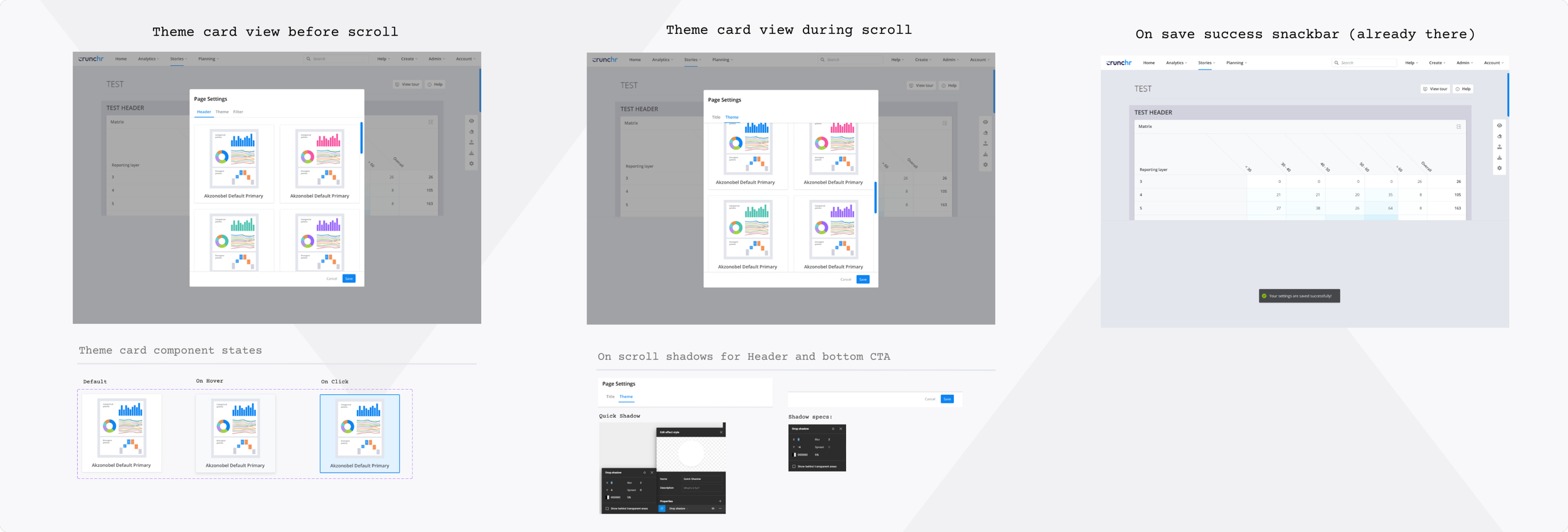
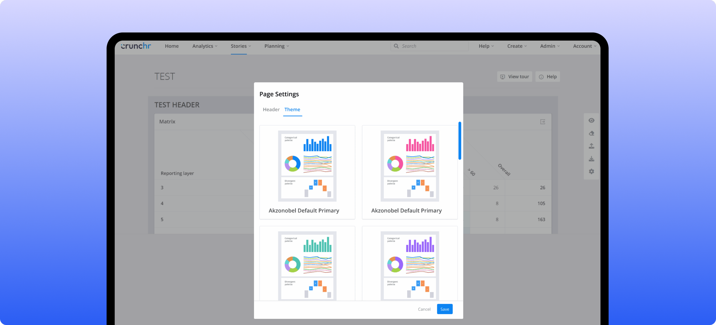
The themes created on the theme overview page would be available in any story by clicking on the themes icon.
The themes created in the theme overview page would be readily available in any story simply by clicking on the easily accessible themes icon. This feature allows readers to visually explore multiple themes and choose a theme that suits the customers’ branding
Key Learnings
Over optimizing UX may not always be the best use of time.
This was a large project with many components. I spent a lot of time on resizing widgets, which turned out to be unnecessary. I aimed to improve the user experience by setting smart minimum and maximum sizes for each widget, but this wasn't very effective, so we had to remove it from the code.
The design lacked visual appeal and still had usability problems.
The dashboard's features were ready, but its design was not appealing. As we mostly utilized components from the existing design system (which was plain and boring) it lacked appeal for a full customer rollout. We recognized the need for phase 2 more than ever.