
Improving usability of Dashboard builder (Stories)
After launching the MVP version of Stories that was used by CS, there was a need to improve the usability to be able to release the builder to customers.
B2B
〰️
People analytics
〰️
HR technology
〰️
Data visualizations, widgets and metrics
〰️
B2B 〰️ People analytics 〰️ HR technology 〰️ Data visualizations, widgets and metrics 〰️
Overview
Duration
6 months
My Role
UX Research
Product Design
UI Design
Deliverables
User research
User flows
Information architecture
Hi-fidelity designs
Component library
Team
Product Manager
4 Front end developers
1 Backend developer
Technical lead
Product Designer (Myself)
The current design of the dashboard builder was too plain for a customer launch. It was not easy to use and needed to be more user-friendly.
Challenge
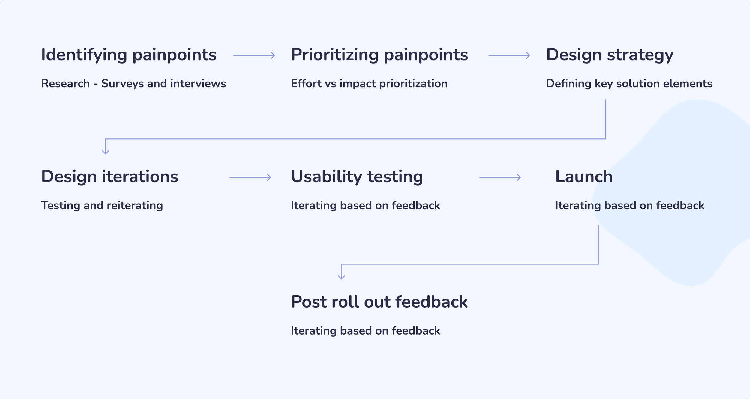
For about 6 months, I led the end-to-end design process working intensively with FE & BE engineers , PMs to improve the usability of the dashboard creator.
It included surveying painpoints, leading design strategy, rethinking information architecture and creating hi-fidelity visuals .
My Role
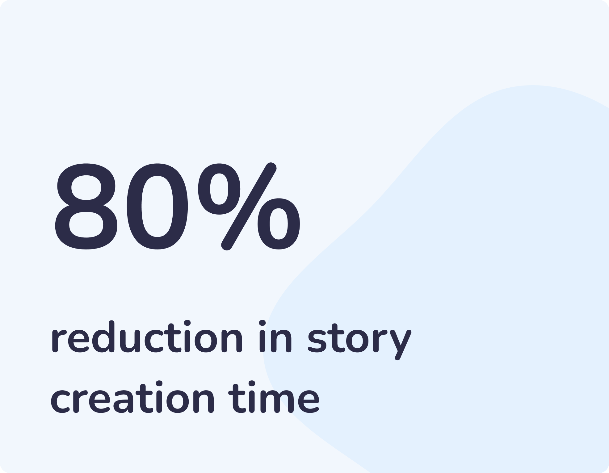
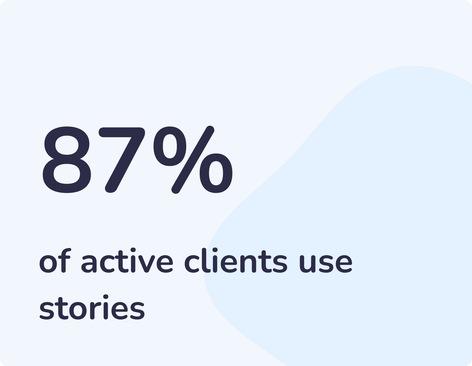
Business impact
Process
I started asking myself some questions.
How is the story creator guided in creating a story?
How easy is it to find and navigate through the relevant options while creating a story?
How easy is the process of creating a widget?
How easy is the process of metric configuration?
Does the story creator get appropriate feedback on user actions?
Can they recover from any unwanted actions accidentally made?
Are the story creators communicated about their choices made?
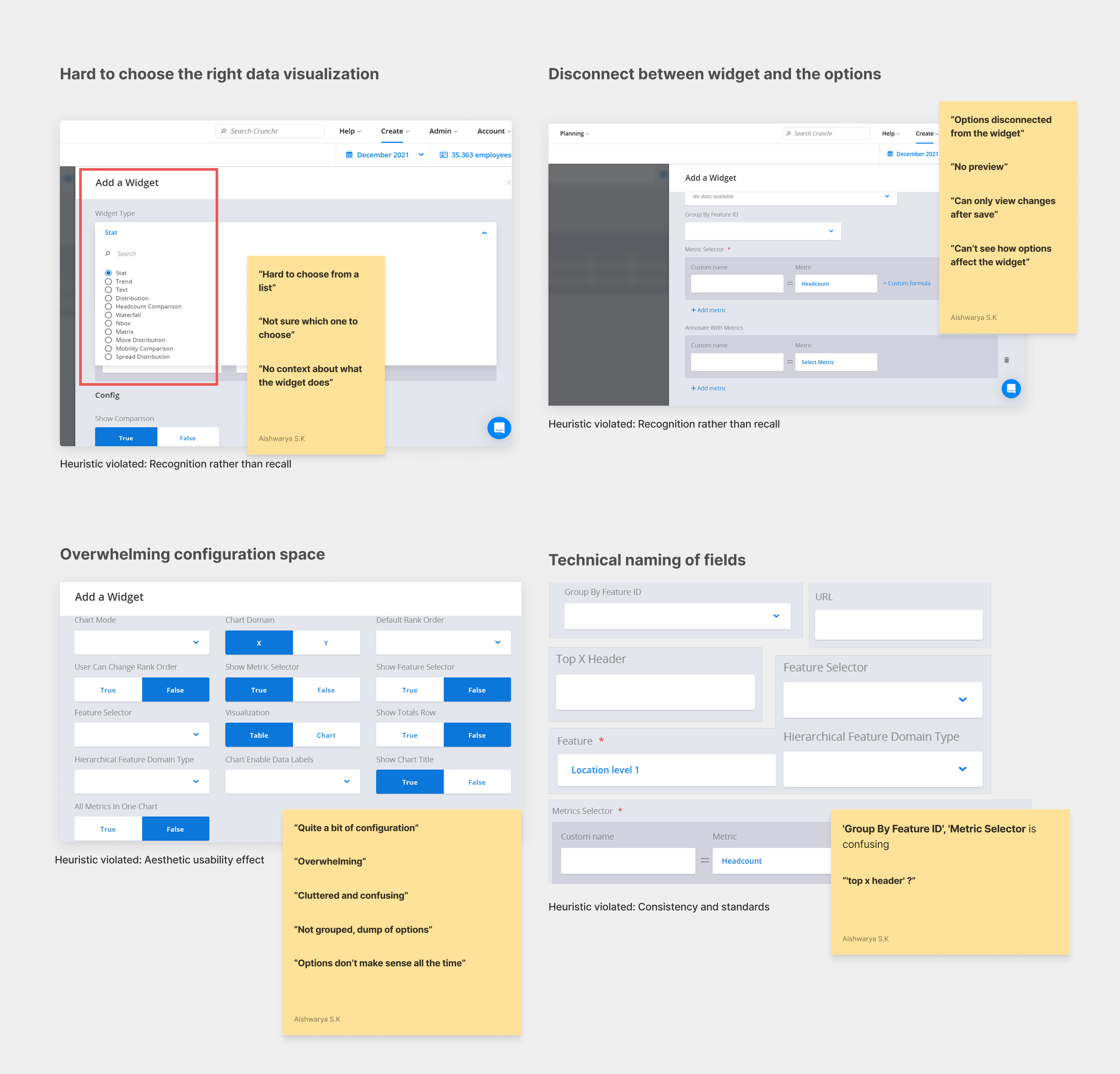
Identifying detailed painpoints
I needed to identify the detailed painpoints users had when using the dashboard creator
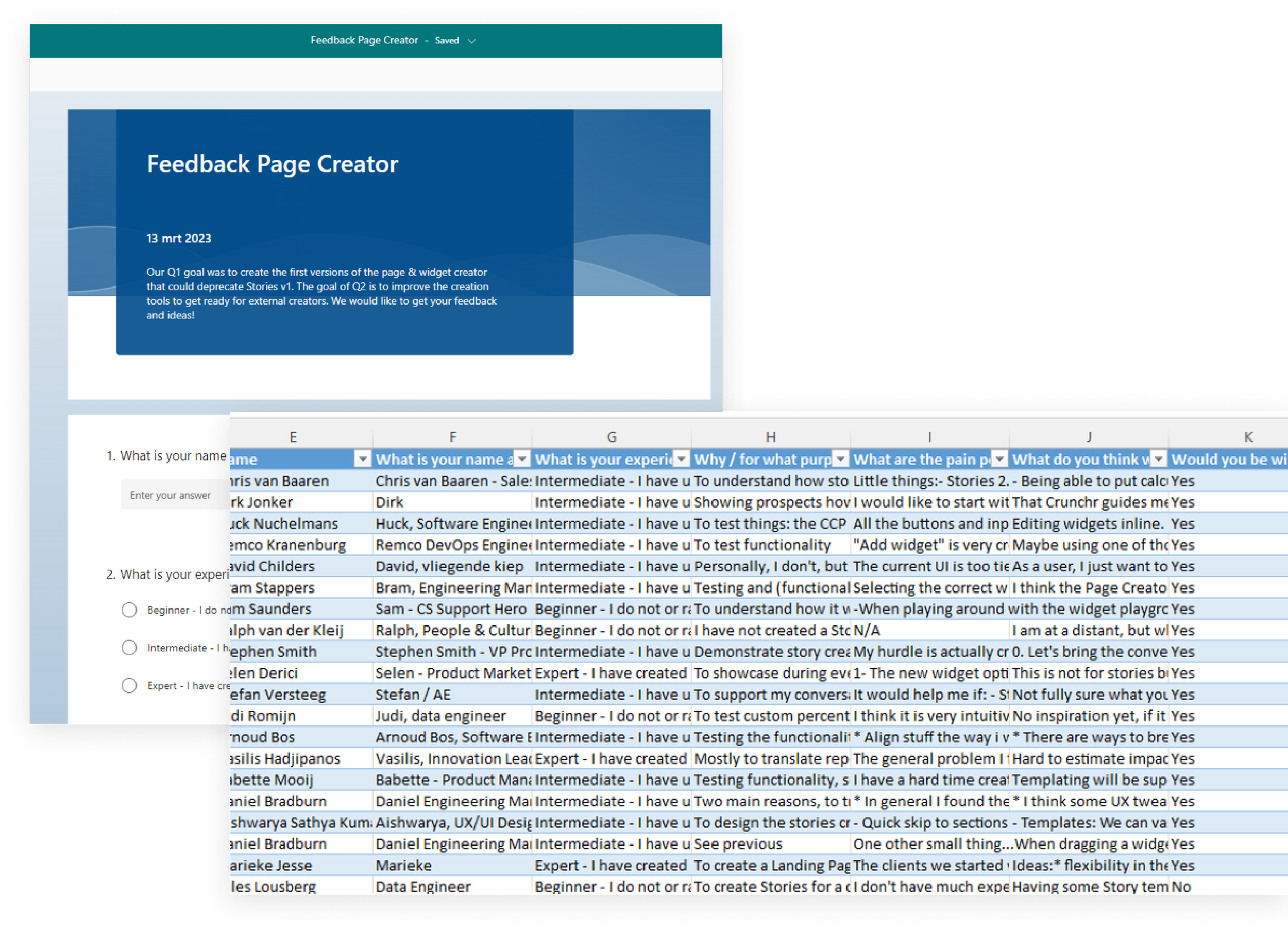
Together with my PM, we shared a survey with some of the clients and internal stakeholders to test out the current version of stories.
So, I conducted a survey..
A goldmine of feedback!
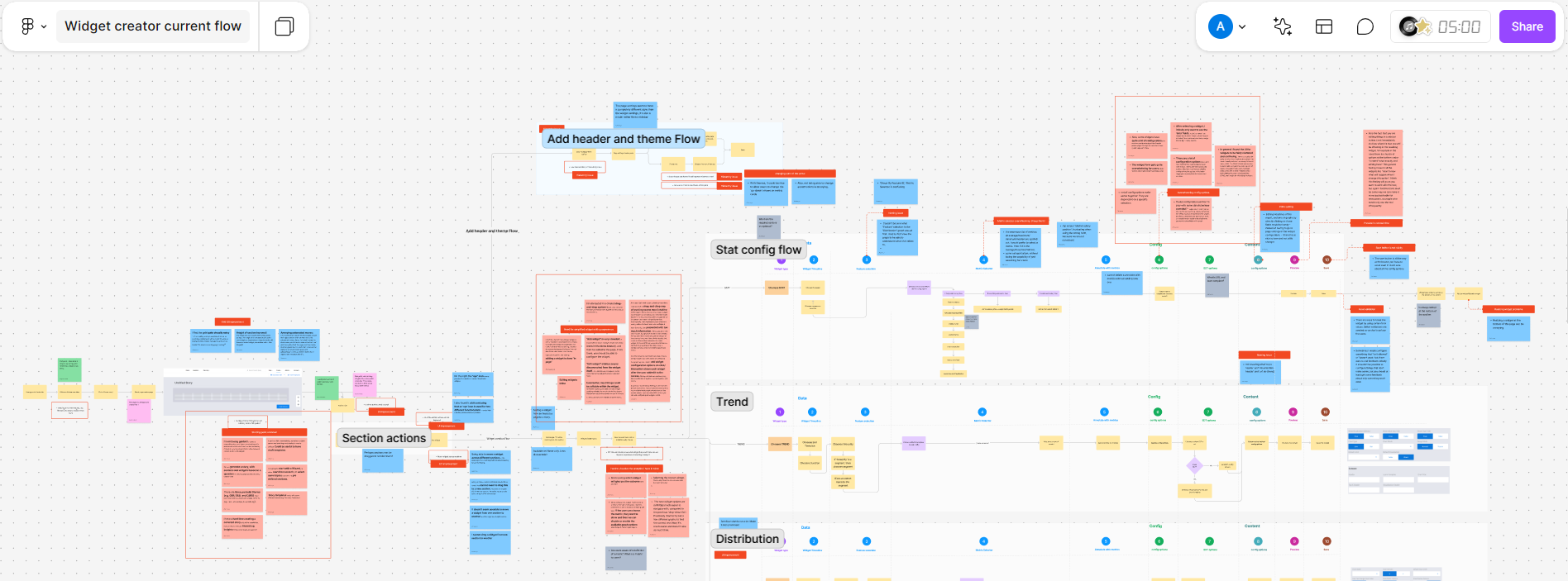
I mapped the painpoints back to the current flow
Mapping the painpoints within the current flow made it super visual, not just for myself but all the team members, especially to my product manager.
It was clear where most of the friction was coming from and which parts of the flow needed attention. Also viewing it this way helped with clear prioritization
Learning. You can’t solve for EVERYTHING
Looking at all the feedback was overwhelming. We were faced with the ground reality, realised we had ton of work to do before releasing it to customers, but you can’t solve for all painpoints, atleast not all at once. I had to prioritise painpoints along with my PM with an effort vs impact evaluation.
We identified 4 most pressing painpoints.
Design strategy and key solution elements
Design explorations
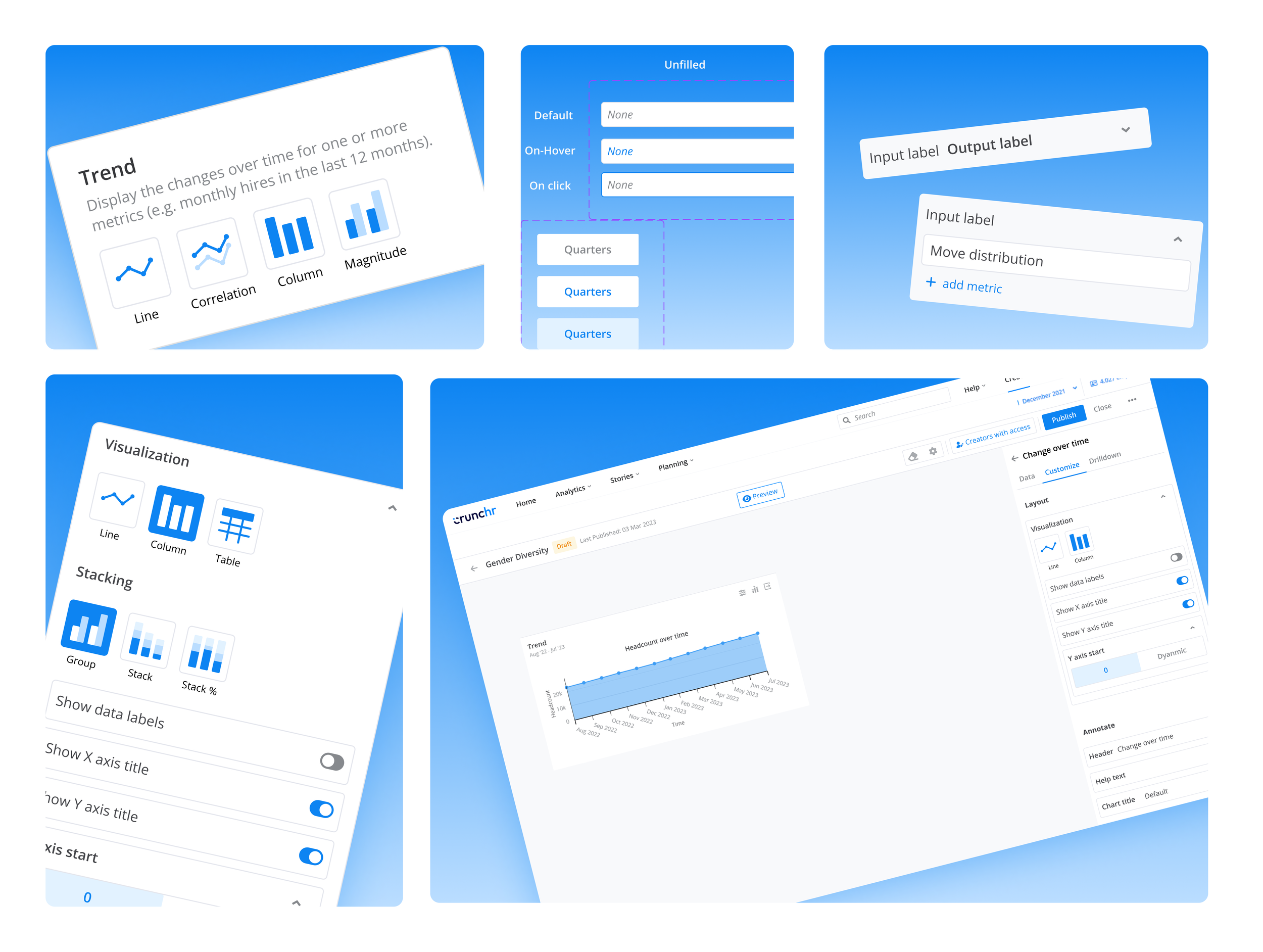
Together with a Senior designer we explored some options to make choosing a widget, easier. I was on vacation, so some of the explorations below were done by a Senior Product Designer. We played around various ideas such as data first, metric first, questions first, theme first and visualization first approaches.
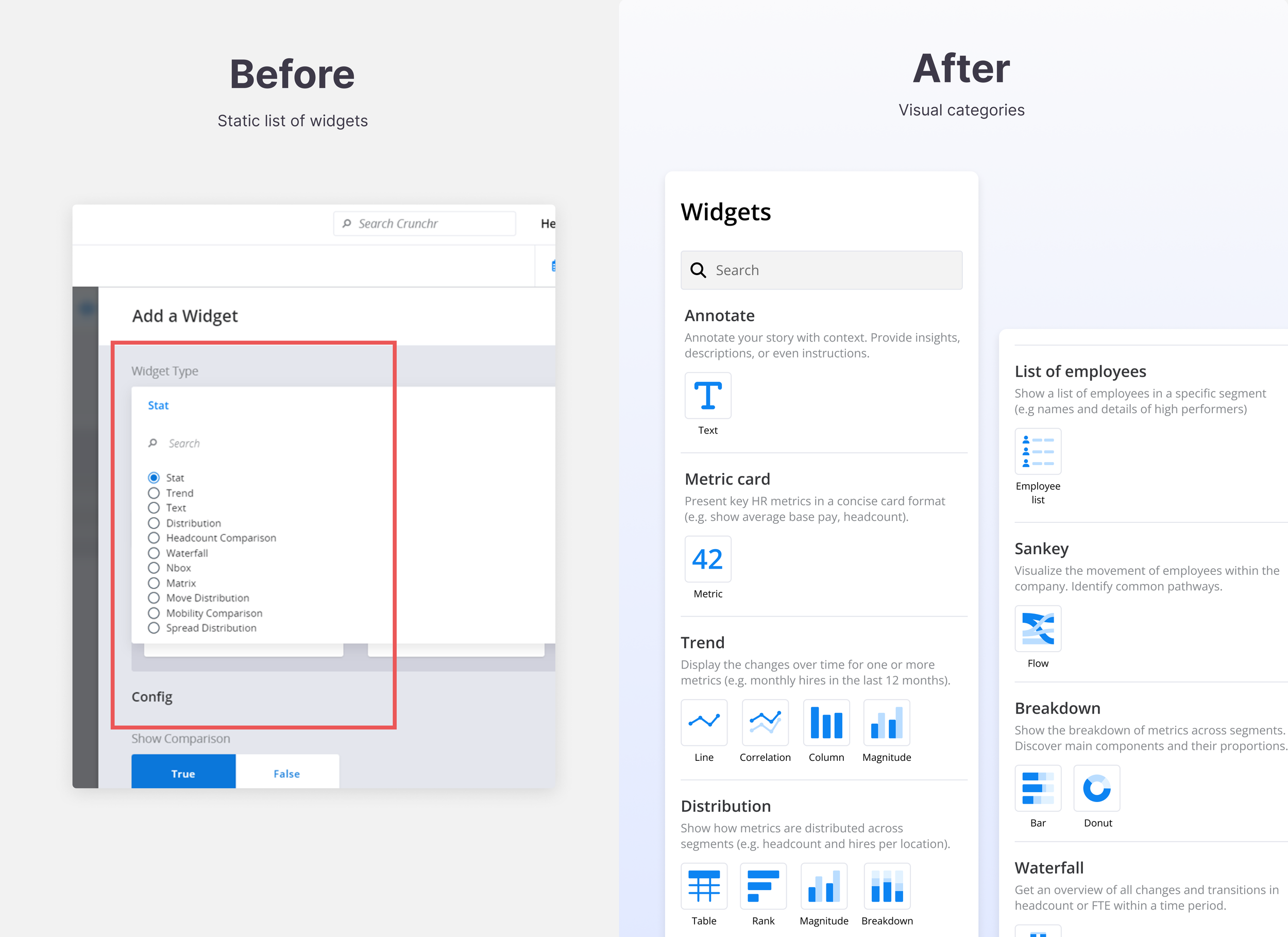
Problem 1: Hard to choose right visualization. How might we enable dashboard creators choose the right widget?
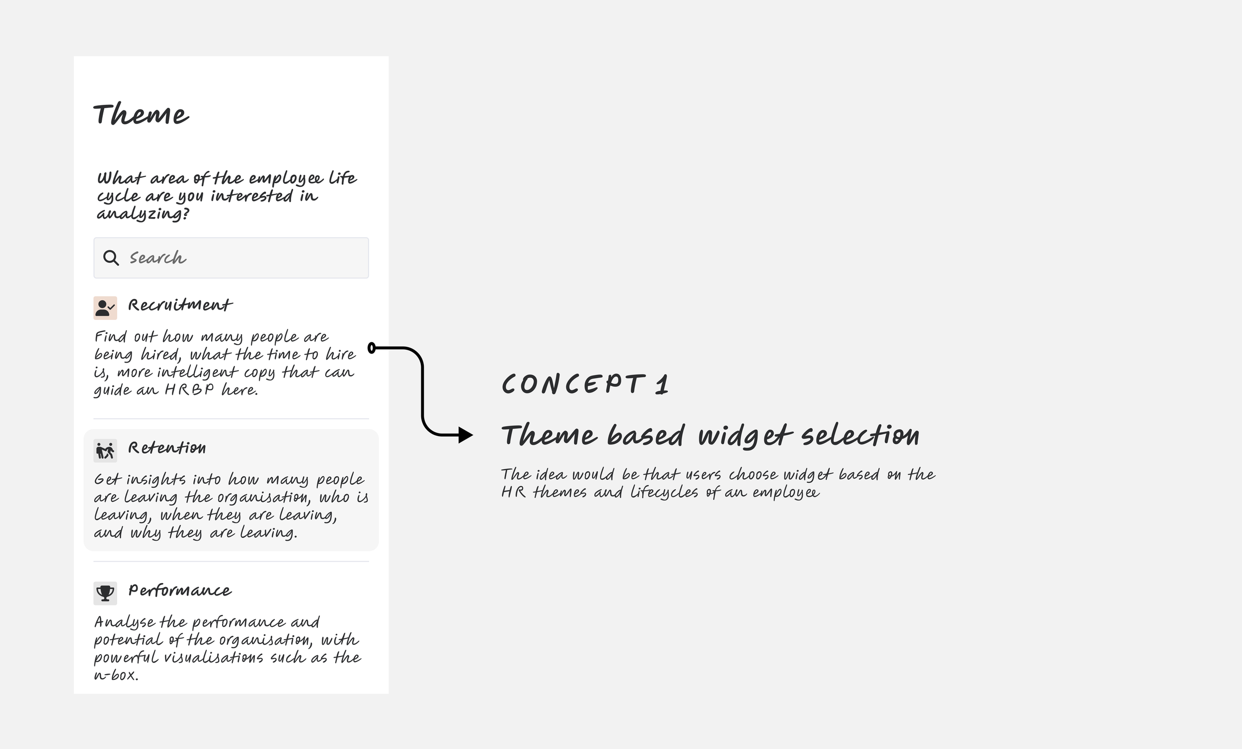


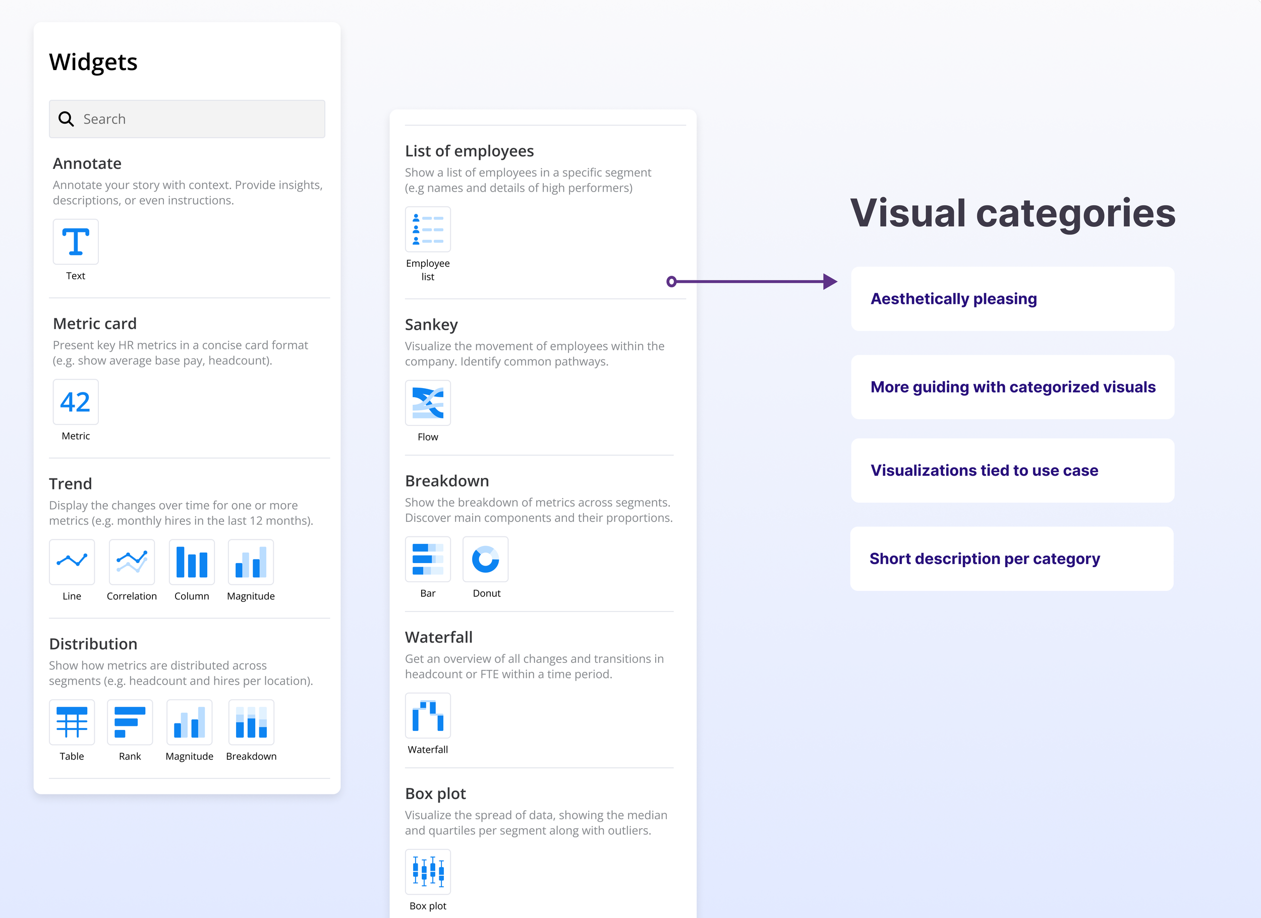
Chosen solution: Concept 3
Although concepts 1 and 2 were creative solutions, it was technically not feasible. How do you support questions? How do we suggest answers based on questions asked? Do we create mappings? How many themes do we support?
In the end, we concluded that concept 3 would be a good balance of user expectations and technical feasibility. We mapped existing widgets into meaningful categories and showcased visual possibilities for each widget type.
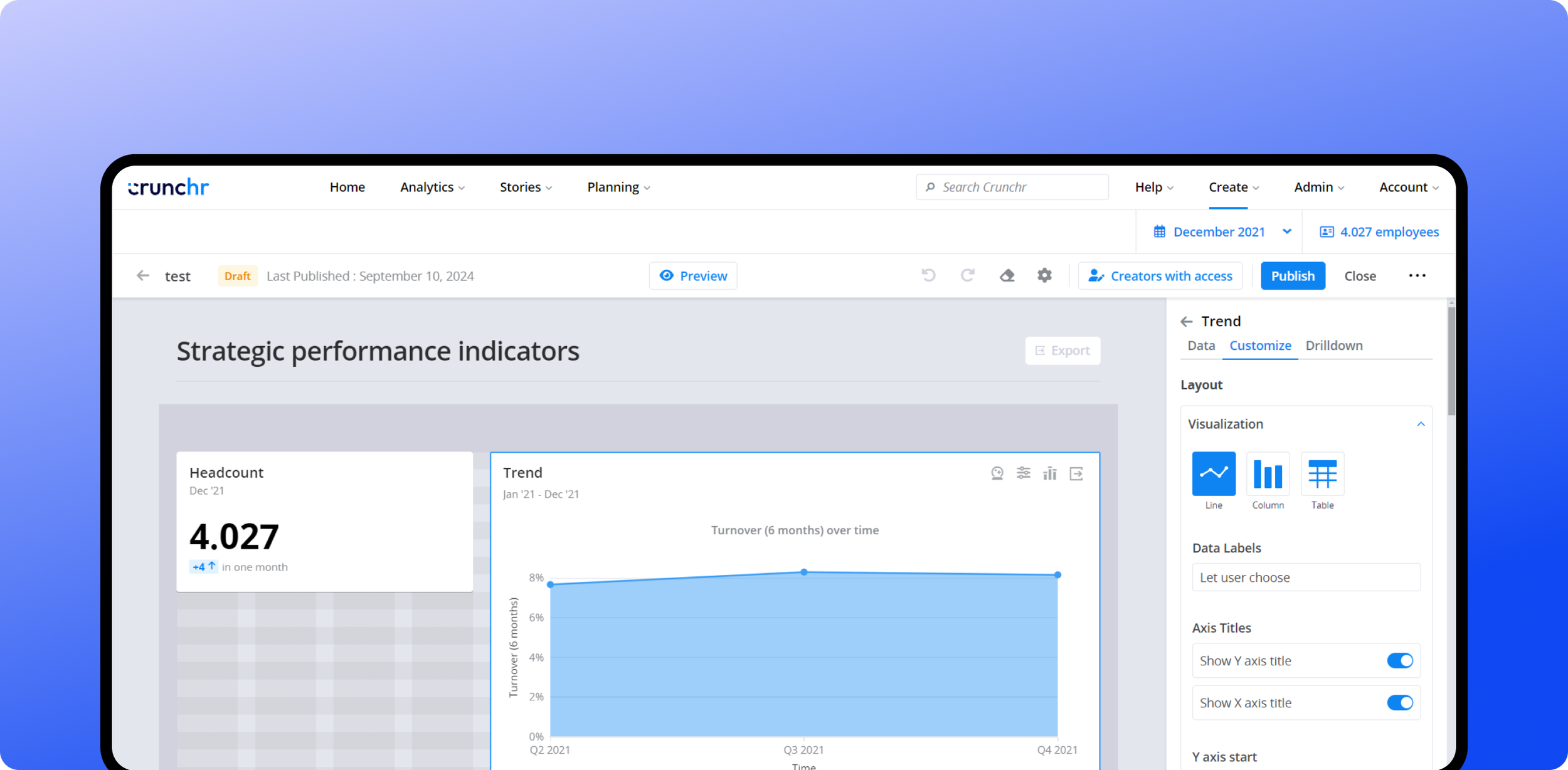
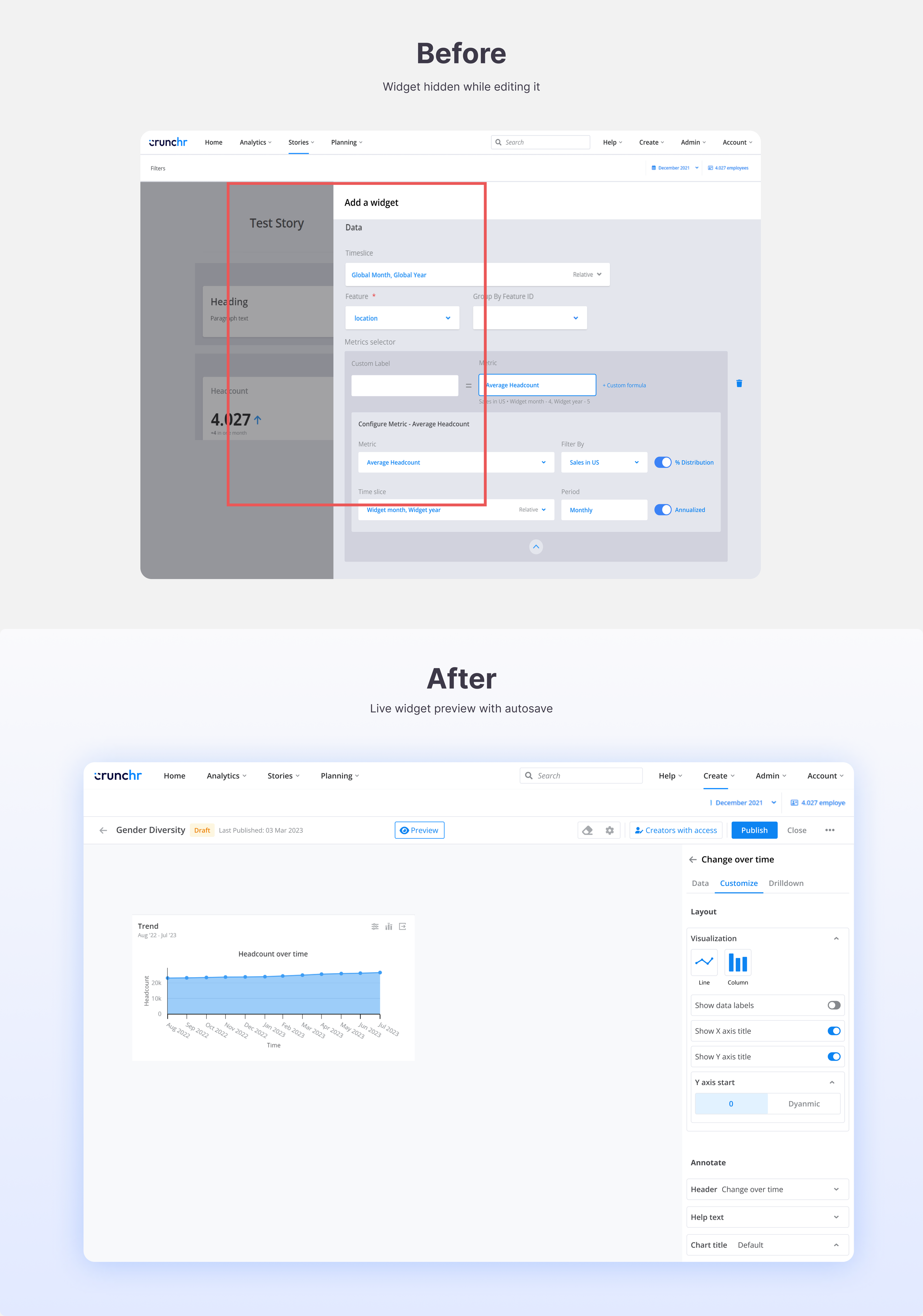
Problem 2: Disconnect between widget and widget form. How might enable immediate feedback when editing a widget?
To edit a widget, one needed to open a sidebar which completely hid the widget being edited. An in-page sidebar which allowed viewing a widget while being edited seemed like the straightforward choice.


Chosen solution: Concept 3
Concept 2 felt too disruptive to open modal each time a user wants to edit a widget. Concept 2 wouldn’t work with large number of widget options.
In the end, we concluded that concept 3 would be the right choice as it allows for previewing the widget while it’s being edited; It’s also a common design pattern
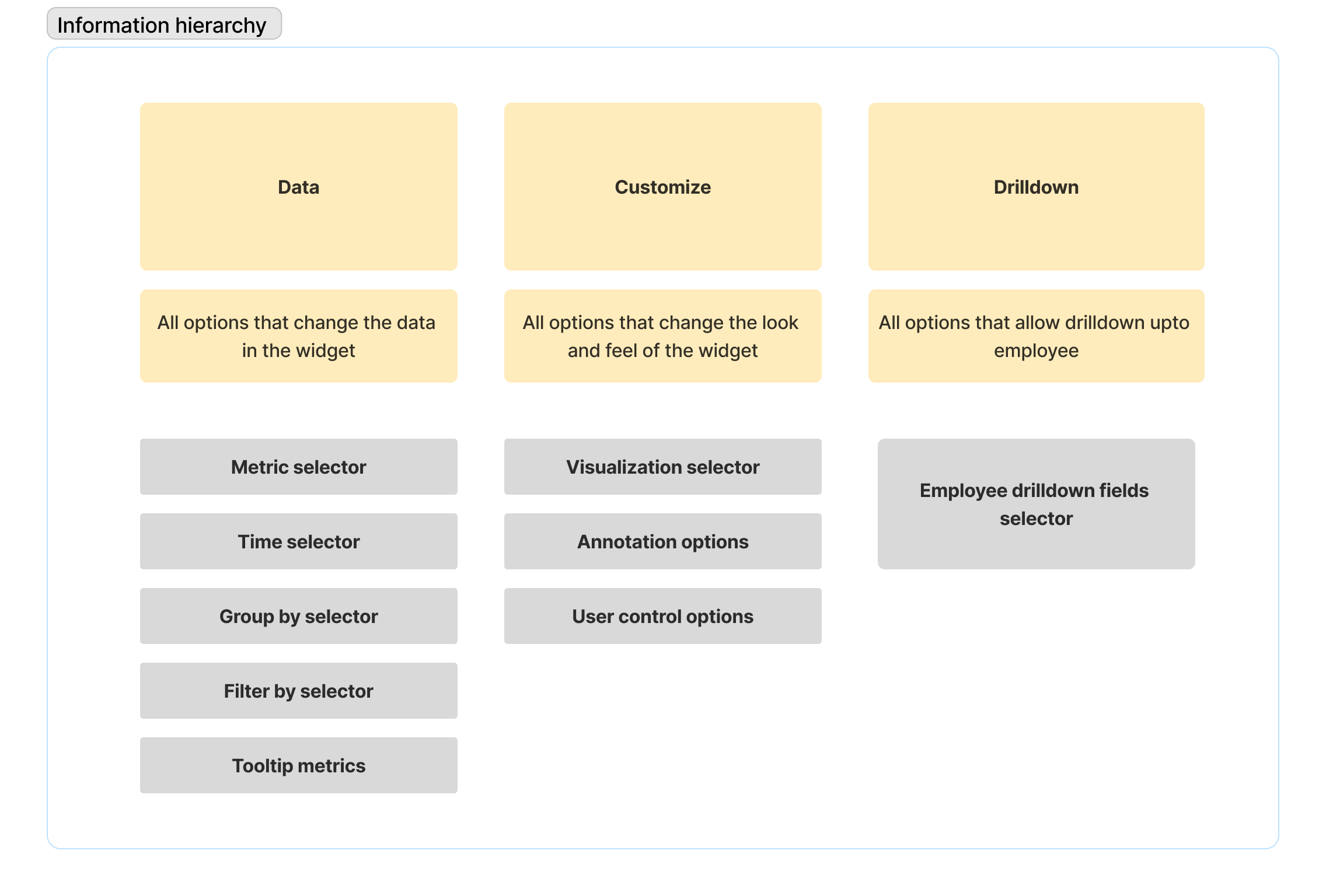
Problem 3: Cluttered widget configuration form. How might we simplify widget edit form?
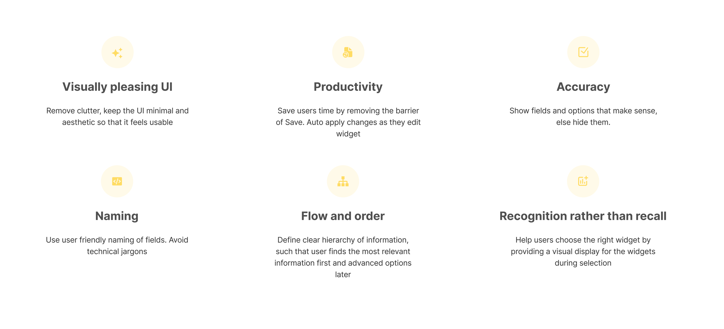
Key solution elements and design philosophy
Create logical groupings
Progressive disclosure
Most important fields first
Conditionally display fields based on logic
Ability to collapse
Improve styling and UI
I identified clusters of actions being performed on the widget. The options could be grouped into data configurations, look & feel configurations and drilldown configurations. So instead of one long form I decided to break the form into 3 tabs. And create logical groupings within each tab.
The widget configuration form had bulky UI form fields, not to mention it was super cluttered. There was no logical order to the fields, important fields were buried at the bottom of the form, irrelevant options showed up when they were not needed. There was a clear need to redo the information hierarchy.
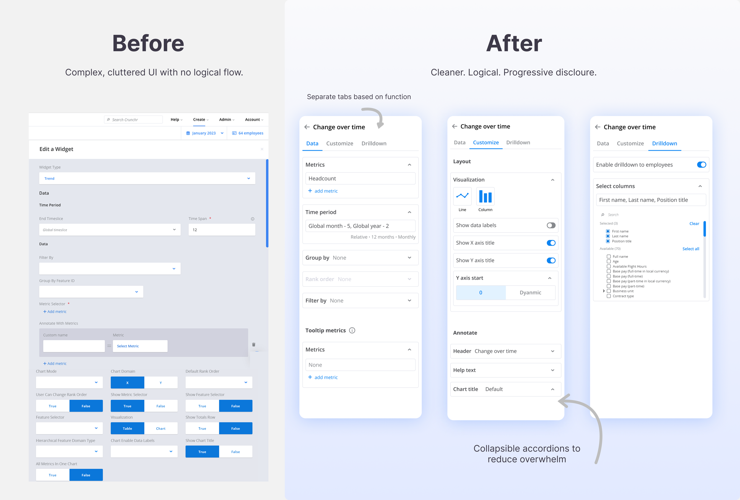
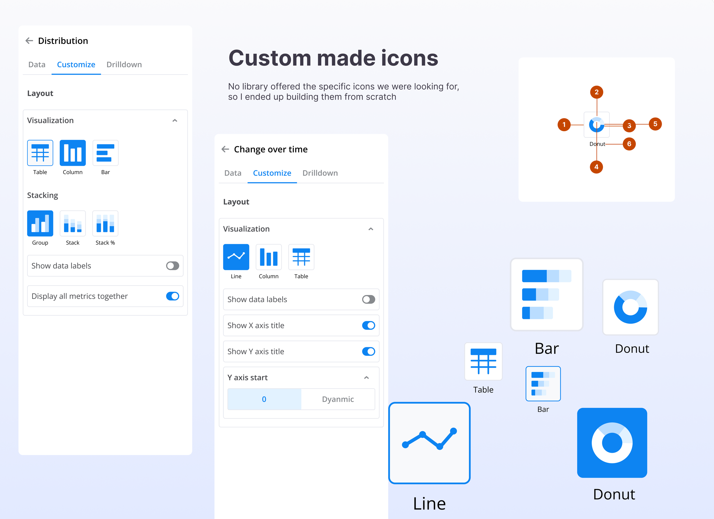
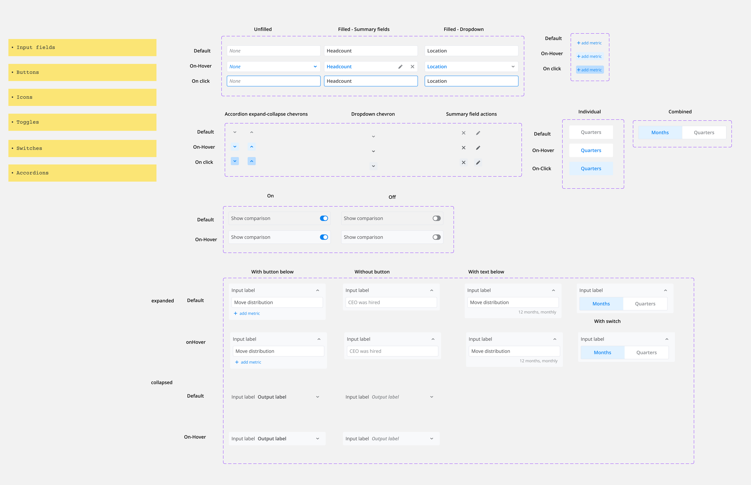
To achieve the minimal and sleek look for form fields, new components were built as the existing design system was too bulky to accomodate fields in a small real estate.
Learnings
Massive scope. Break into prioritized chunks.
This project was high stakes for the business, at the same time was quite complex as it was a redesign of the end-to-end dashboard creation flow. Together with my PM, we broke the scope into multiple chunks of work that enabled us to make iterative progress.
You either research or you end up with a redo.
Through surveys and qualitative interviews we were able to identify areas in the current flow that caused most friction. This was an eye-opener and served as a solid base for prioritizing painpoints to focus on. They also served as pool of ideas for future improvements.
Progress over perfection.
When we had to categorize widgets into meaningful categories, we looked at visual vocabulary from Financial times. It was a perfect system. But our widget system wasn’t built to fit into any other categorization types. We had to make some trade offs there but I spent way too much time trying to make our widget system fit into the perfect categorization. This could have been avoided had I estimated how much time to spend on a particular problem.